All work04 / 09

Client project · Wealth intelligence & design systems

Embassy

A complex wealth platform. One shared design language.

My contribution

Within AGD, I designed UX/UI, developed a Claude-assisted reference system and led design walkthroughs with engineering.

Stage

Live platform · reference system delivered

Timeline

2026 · Product design and handoff

The problem

A data-dense platform needed a consistent interface and a clearer way to review information extracted from documents.

What I delivered

Shared tokens, components, documentation and 32 desktop/mobile reference pages for the development team.

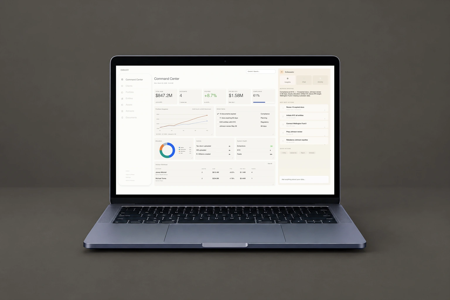
Original Embassy Command Center design in a laptop against a graphite studio background

Original Figma designs and Claude-assisted handoff references, with reference data. Created within the AGD team.

What shaped the experience.

The design had to fit an existing product, support detailed review and adapt the same system to mobile.

01 / Design & implementation

A document queue that supports different review habits

I proposed reviewing ready documents while the rest continued processing, with summary signals beside detailed matching controls.
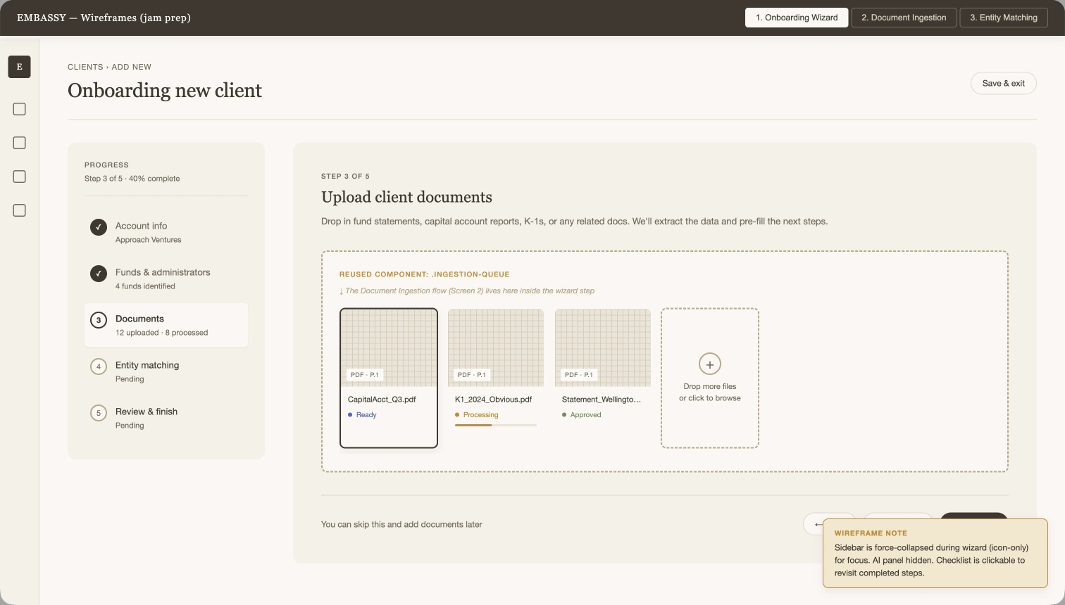
Design detail — A document queue that supports different review habitsExplore the original

Earlier upload design; the later review is described below.

Review & follow-through

In a later review, engineering asked for more PDF space and a Client → Entities → Holdings summary to make the extracted structure easier to inspect.

Discussion & delivery

Documents can finish processing at different times, and reviewers do not all inspect information at the same level of detail.

The working session compared waiting to advance the flow with allowing a ready document into review. Engineers also described quick-check and detail-oriented client behavior.

The later coded onboarding prototype includes a larger review area and document queue. It is a design reference with illustrative data.
02 / Design & implementation

From a visual direction to an inspectable handoff

I used Figma and Claude to build the reference package, reviewed the output and documented tokens, shared components and mobile patterns.

Design detail — From a visual direction to an inspectable handoffExplore the original

Selected design reference from the project.

Review & follow-through

In walkthroughs, engineers discussed how to adapt the code and requested local card tabs, consistent chart families and clearer account context.

Discussion & delivery

Engineering needed to translate an established design direction into an existing product across many page types.

The workflow combined approved high-fidelity screens for calibration with lower-fidelity pages that still needed the system applied.

Delivered: 16 desktop and 16 mobile references, a visual showcase and documentation. Production integration remained with engineering.

The design, in detail.

An overview that leads into the detail.

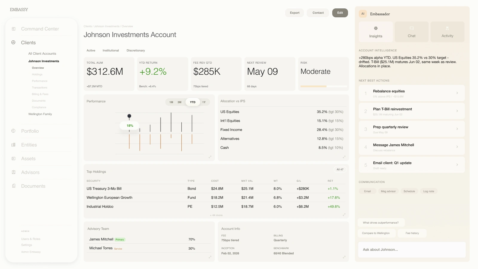
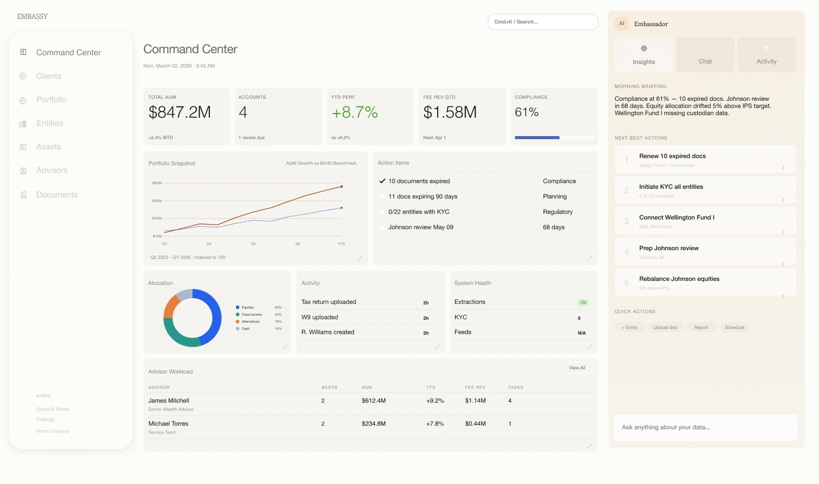
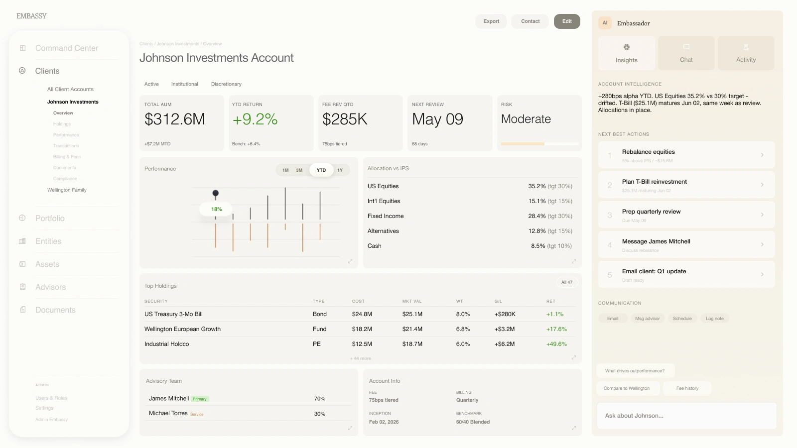
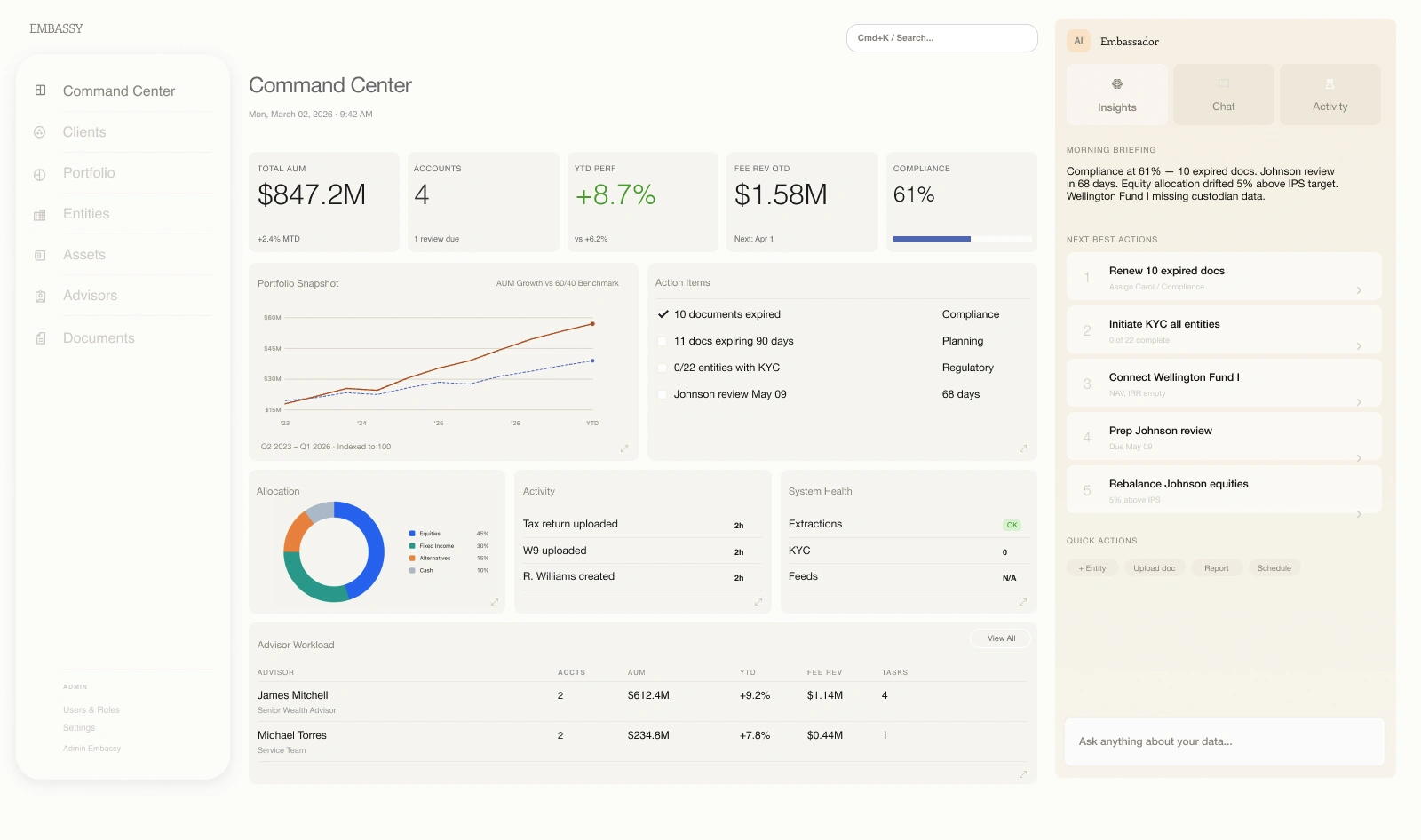
The Command Center brings performance, operational priorities, and advisor workload into a common view. Account pages retain the same structure while introducing a closer view of holdings, risk, and next actions.

Command Center · original Figma design, including the lower workload module.Full screen
Command Center · original Figma design, including the lower workload module.
Account detail · holdings, team, and account context alongside Embassador.Full screen
Account detail · holdings, team, and account context alongside Embassador.
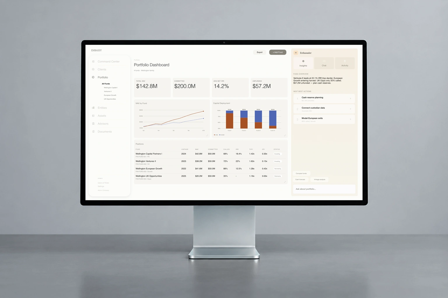
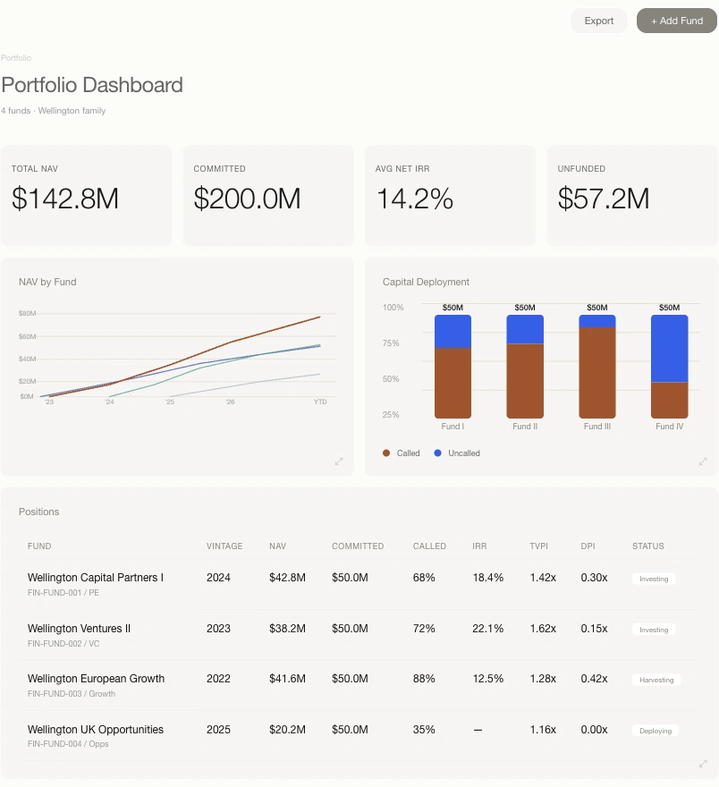
Original Embassy portfolio dashboard in a front-facing desktop display against a slate background
The portfolio view brings fund performance, capital deployment, and positions into the shared interface. Original Figma design.

A system with rules you can see.

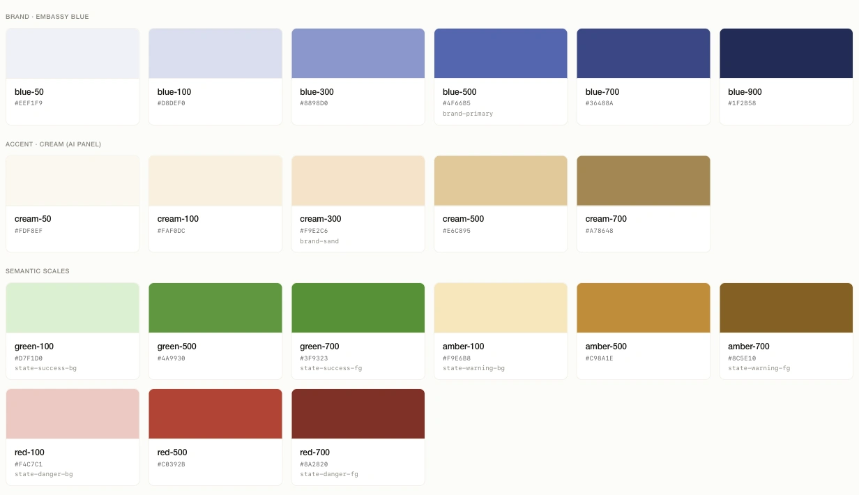
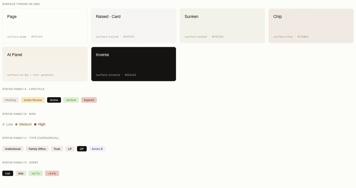
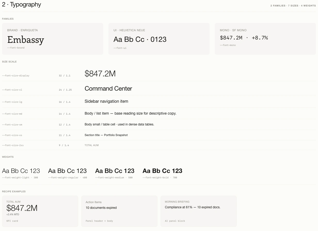
The visual catalog makes the shared foundations inspectable. Color values have semantic roles; workflow, risk, category, and financial events use separate status families. Typography defines how a headline number differs from a supporting label.

Original coded showcase · brand, accent, and semantic color scales.Full design
Original coded showcase · brand, accent, and semantic color scales.
Original coded showcase · surface roles and the four status families.Full design
Original coded showcase · surface roles and the four status families.
Original coded showcase · type families, scale, weights, and usage examples.Full design
Original coded showcase · type families, scale, weights, and usage examples.

A handoff you can open, inspect, and discuss.

I used Claude to turn design decisions into a working reference package. My role was to direct the system, review the output, and work through the implementation with the developers.

01 / Foundations

One source for the rules.

Shared tokens define color, type, spacing, shape, and data visualization. Semantic names connect each value to its purpose.

PalettePurposeComponent

02 / Reference implementation

Decisions made tangible.

HTML/CSS pages, a visual showcase, and component documentation show how the pieces work together. Claude helped extend the system into reference layouts and mobile studies under my direction.

16 desktop + 16 mobile references

03 / Developer collaboration

Walk through the decisions.

I led a dedicated walkthrough with the development team, explained the system, and worked through mobile behavior and document-review questions. The feedback informed the next iteration of the handoff.

Design direction → review → implementation

The coded package is a design reference for the existing platform. Reference charts and assistant interactions illustrate the intended experience; production data and backend integration belong to the engineering implementation.

How the pieces connect.

A retrospective map of the designs and engineering working sessions. The document flow below represents the onboarding design and prototype, not a claim about every production state.

EmbassyExperience map
01

Understand the portfolio

  • Command Center and priorities
  • Client and investment accounts
  • Portfolio, funds, and assets
02

Connect the information

  • People and legal entities
  • Holdings and relationships
  • Supporting documents
03

Review documents

  • Upload and processing queue
  • Extracted information and matching
  • Review, correction, and summary
04

Keep assistance close

  • Contextual insights
  • Chat and activity
  • Desktop panel and mobile control

Document onboarding: make the next decision visible

  1. 01

    Upload

    Introduce the documents and show what has entered the queue.

  2. 02

    Follow processing

    Surface status and keep ready documents available while others process.

  3. 03

    Review and resolve

    Inspect extracted information, correct fields, and resolve matching states.

  4. 04

    Check the summary

    Make the relationship between client, entities, and holdings understandable.

The same components, in different contexts.

A portfolio view combines actions, KPI cards, charts, and a detailed table. The account and overview pages reuse that language for holdings, operational activity, and workload. These close-ups show the system below the page opening.

Coded reference · action hierarchy, KPI cards, chart families, and positions table.Full design
Coded reference · action hierarchy, KPI cards, chart families, and positions table.
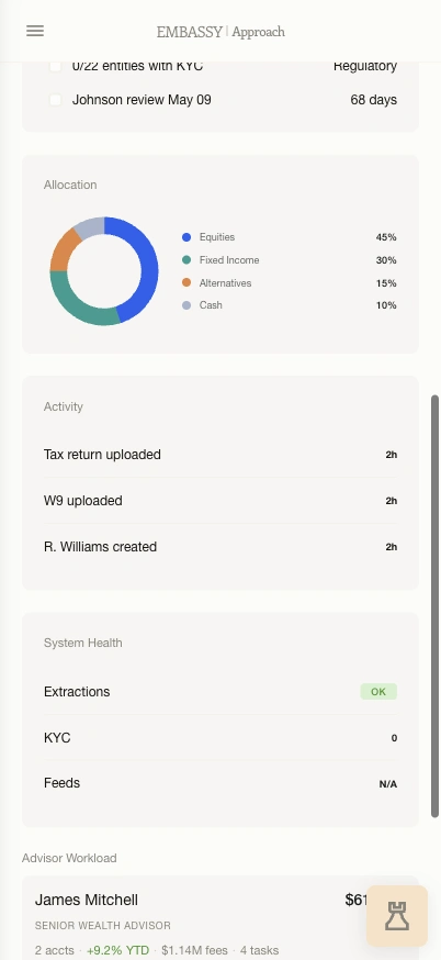
Original Figma detail · allocation, activity, system health, and advisor workload.Full design
Original Figma detail · allocation, activity, system health, and advisor workload.
Original Figma detail · holdings, advisor roles, and account information.Full design
Original Figma detail · holdings, advisor roles, and account information.

Mobile changes the structure.

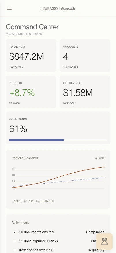
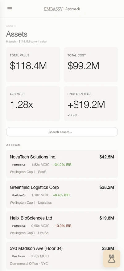
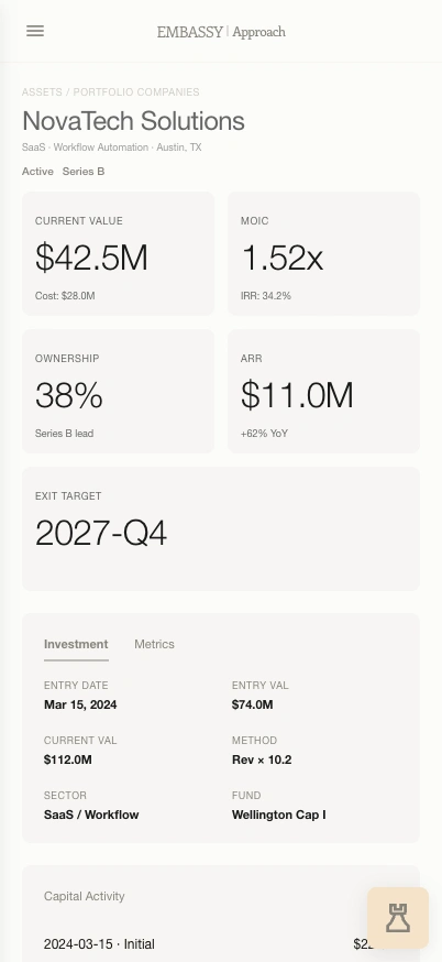
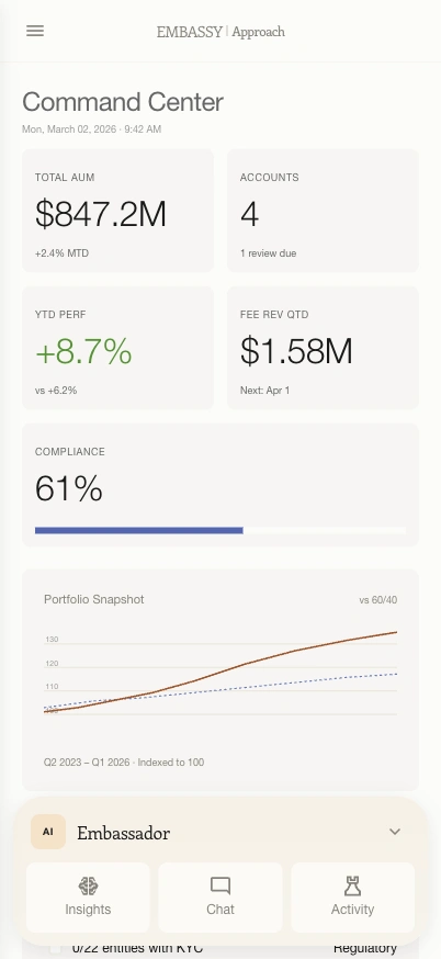
The mobile studies reuse the same tokens while changing density and navigation. KPI cards form smaller groups, lists use stacked data cards, and lower content remains part of the design. I directed and reviewed these Claude-assisted references for the handoff.

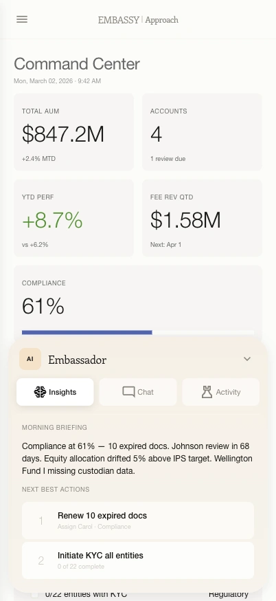
Coded mobile reference · the overview with a compact resting AI control.Full screen
Coded mobile reference · the overview with a compact resting AI control.
Coded mobile reference · operational information further down the page.Full screen
Coded mobile reference · operational information further down the page.
Coded mobile reference · asset information adapted into cards.Full screen
Coded mobile reference · asset information adapted into cards.
Coded mobile reference · asset-level information and local navigation.Full screen
Coded mobile reference · asset-level information and local navigation.

Assistance that gives the page room.

The desktop assistant occupies its own column. On mobile, it moves through a compact resting state, a quick choice of tools, and an expanded panel. The reference makes those states tangible for developer discussion.

Peek state · choose Insights, Chat, or Activity from the original reference.Full screen
Peek state · choose Insights, Chat, or Activity from the original reference.
Expanded state · contextual guidance opens while the account stays in view.Full screen
Expanded state · contextual guidance opens while the account stays in view.
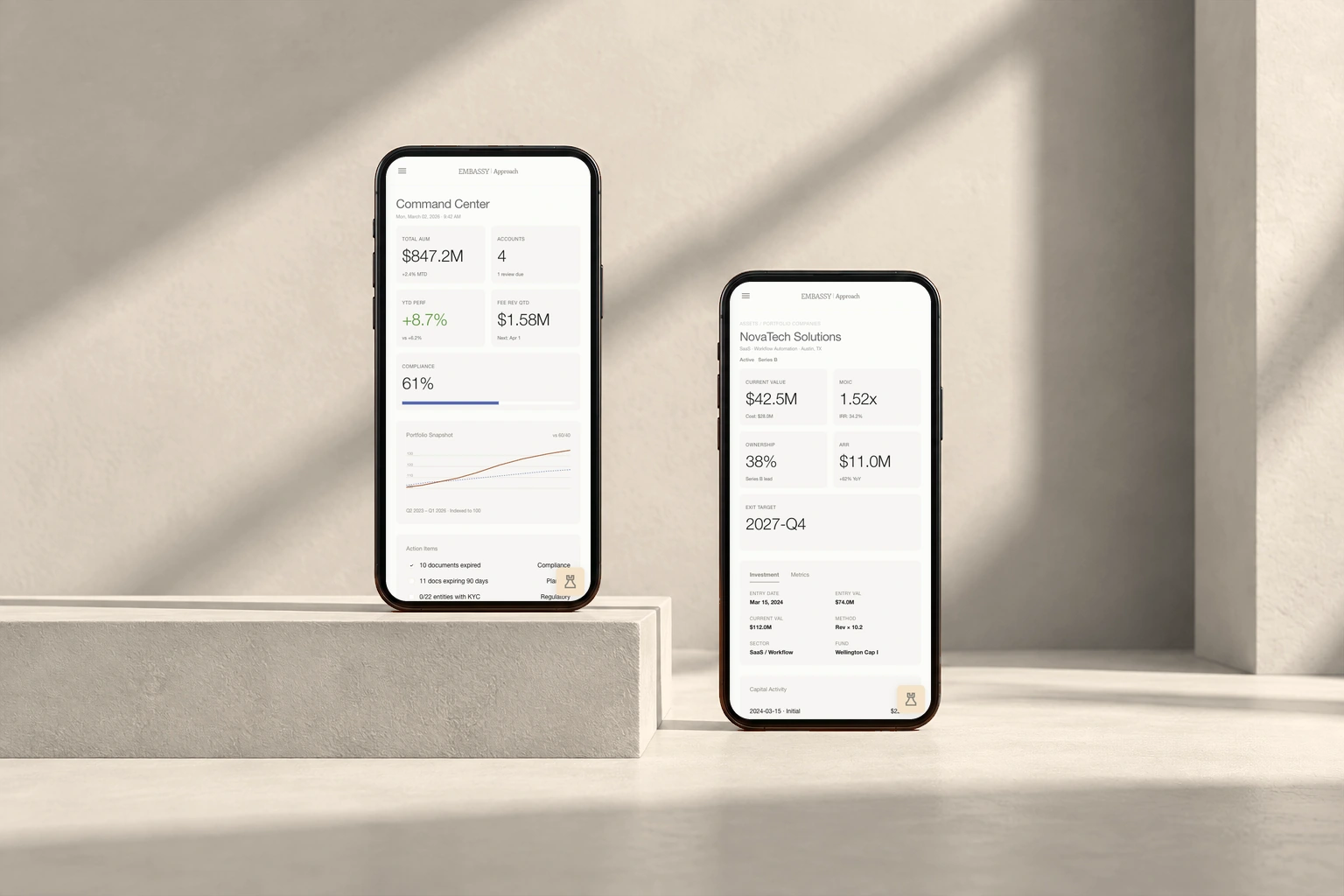
Original coded Embassy mobile overview and asset detail in paired phones against a warm sand background
One shared foundation across the overview and an asset detail. Claude-assisted mobile handoff references.

Make document review understandable.

In working sessions with engineering, I helped shape upload, processing, matching, and review. The drafts expose what the system understood and what still needs a human decision. Later feedback called for more document space and a clearer Client → Entities → Holdings summary.

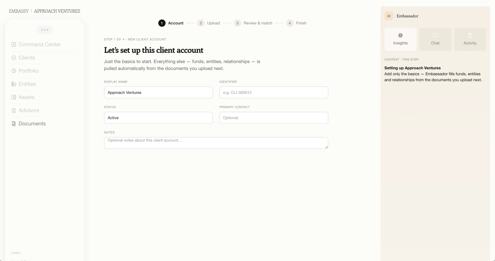
Original reference from Figma · account setup establishes context for the documents.Full screen
Original reference from Figma · account setup establishes context for the documents.
Original working draft · document queue and processing states, with design annotations.Full screen
Original working draft · document queue and processing states, with design annotations.
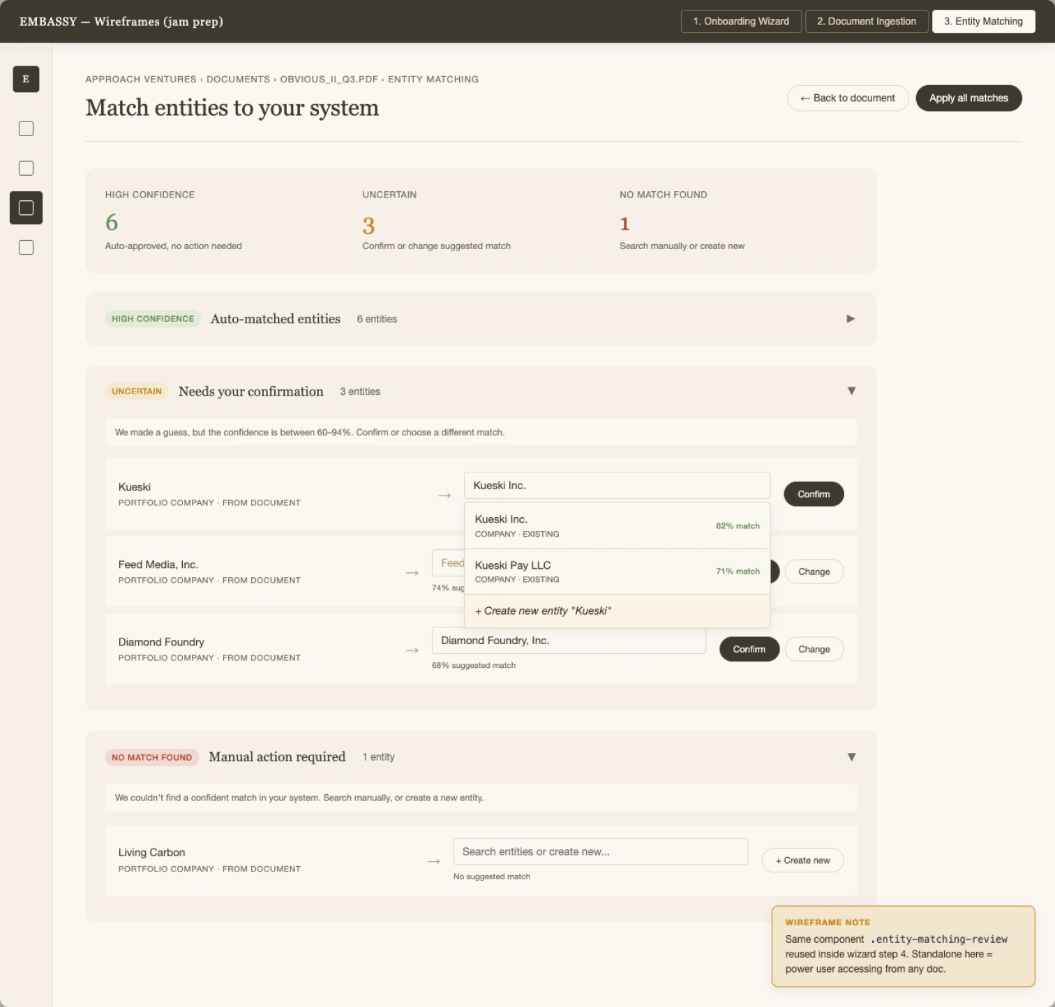
Original working draft · matched, uncertain, and unmatched information across the full review view.Full screen
Original working draft · matched, uncertain, and unmatched information across the full review view.

Small states carry important context.

Progress helps someone understand where they are in onboarding. An empty relationship state explains what is missing and keeps the next action visible. These details are part of the handoff, alongside the main dashboards.

Original UI detail · account creation, document upload, content review, and completion.Full design
Original UI detail · account creation, document upload, content review, and completion.
Original UI detail · a clear empty state and an Add Relationship action.Full design
Original UI detail · a clear empty state and an Add Relationship action.

Character, with a consistent structure.

#FCFCFA
#F6F5F1
#151411
#4F66B5
#F9E2C6

Semantic status families

Lifecycle, risk, category, and financial event each have their own visual rules.

A shared data language

KPI cards, chart styles, legends, and table treatments repeat across account, portfolio, and asset contexts.

Mobile information patterns

Drawers, data cards, and compact AI controls adapt the same system to a smaller reading area.

Code as a design reference

Tokens, component examples, page references, and living documentation make design intent inspectable during implementation.

What took shape.

A shared design-system package for the development team: foundations, components, a visual showcase, and 32 desktop and mobile reference pages. I presented the system and worked directly with the developers on responsive behavior, document review, and implementation details. Embassy is a live platform; the screens here show the design and reference work I contributed.

Reference pages16 desktop + 16 mobile
SystemTokens, components & documentation
DeliveryClaude-assisted code + developer walkthroughs

Next design question

For a complex platform, a handoff needs to explain behavior as clearly as appearance. The next priority is to validate the integrated workflows with the people using them and trace any implementation differences back to the shared system.

Next projectNew York Academy of Art