All work03 / 09

Therapy matching · Platform redesign

Glow

A clearer path from assessment to appointment.

My contribution

I reviewed and redesigned the assessment-to-booking journey, client and therapist dashboards, and desktop and mobile UI.

Stage

Redesign and product demo delivered

Timeline

Ongoing engagement during product refinement

The problem

A dense assessment, fragmented journey and incomplete dashboards made the product's next steps difficult to follow.

What I delivered

A product redesign and demo covering matching, professional profiles, scheduling and session management.

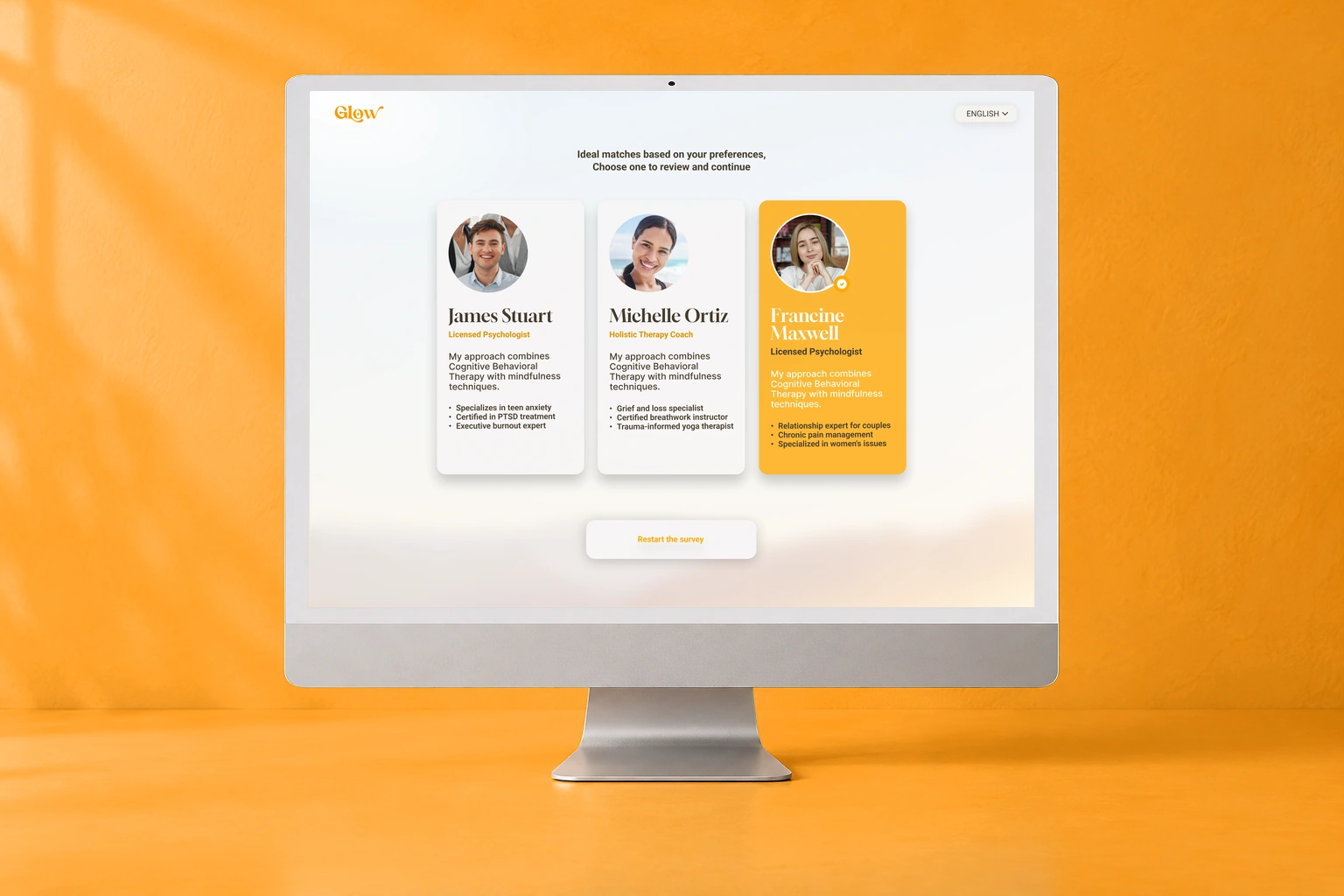
Original Glow therapist recommendations displayed against a warm orange studio background

Original Figma screens in a presentation mockup. Profile content and dashboard figures are sample data.

What shaped the experience.

One service needed to support two distinct task sets, from a client's first choice to a therapist's session requests.

01 / Design rationale

Turn a match into an informed next step

Move from preferences to comparable recommendations, a detailed profile and a calendar.
Design detail — Turn a match into an informed next step (1)Design detail — Turn a match into an informed next step (2)Explore the original

Why this structure

Each stage adds information for the next decision: compare an approach, inspect the professional, then choose a time.
02 / Design rationale

Organize each dashboard around its user's work

Separate client session management from therapist requests and scheduling.

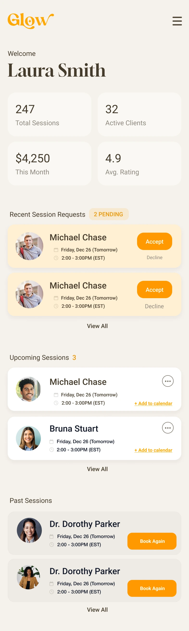
Design detail — Organize each dashboard around its user's work (1)Design detail — Organize each dashboard around its user's work (2)Explore the original

Why this structure

The shared service retains a common visual language while putting different responsibilities first for each audience.

The design, in detail.

A complete path, on mobile.

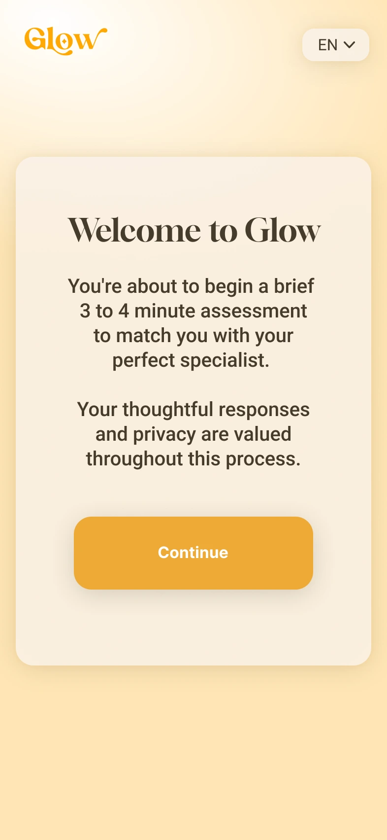
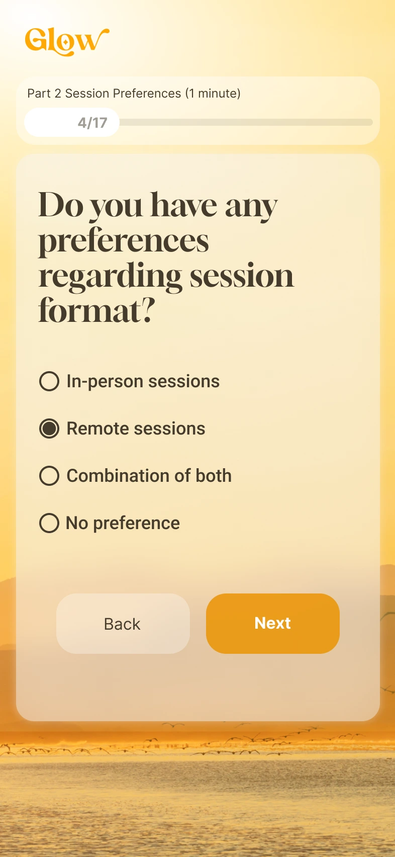
The assessment starts with a short introduction, asks for specific preferences, and leads into a shortlist. Each step gives the next decision its own space.

An introduction with a clear route into the assessment.Full screen
An introduction with a clear route into the assessment.
Session format preferences with visible progress.Full screen
Session format preferences with visible progress.
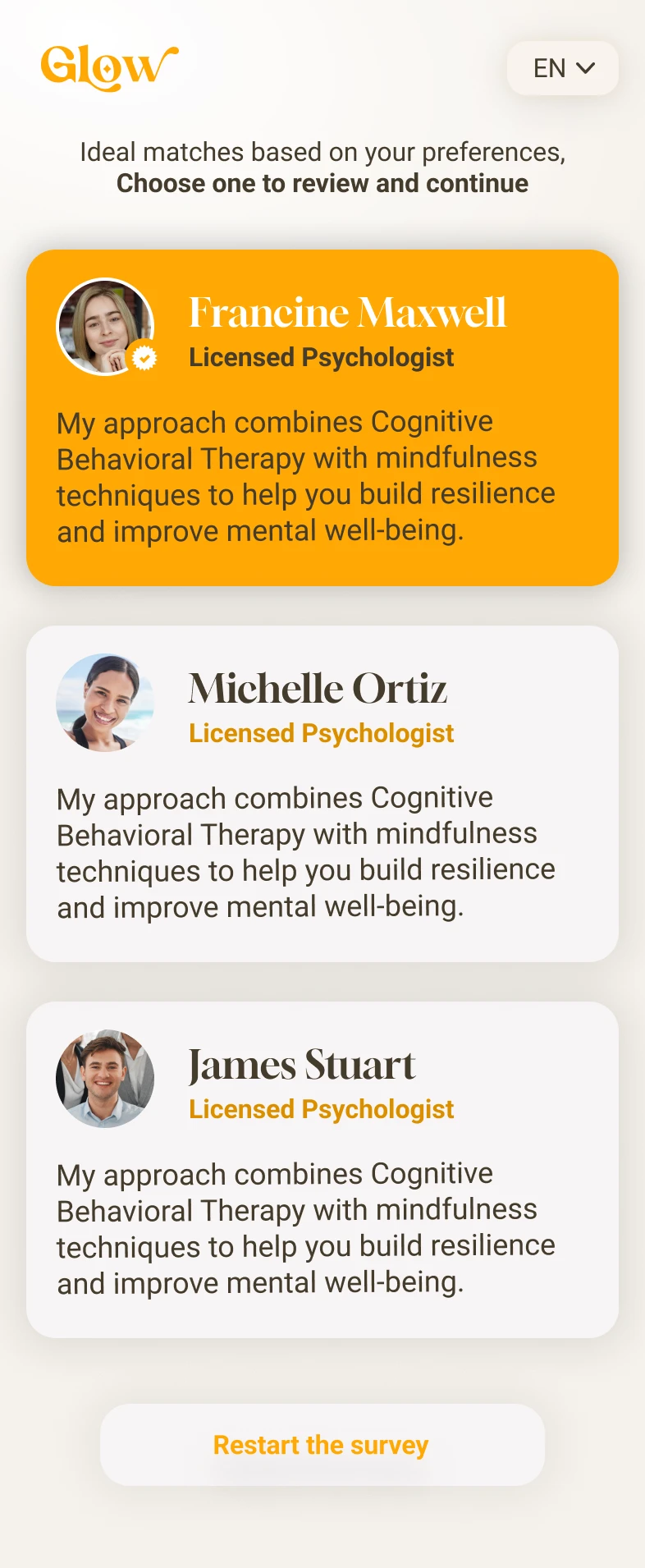
A vertical shortlist of professionals to review.Full screen
A vertical shortlist of professionals to review.
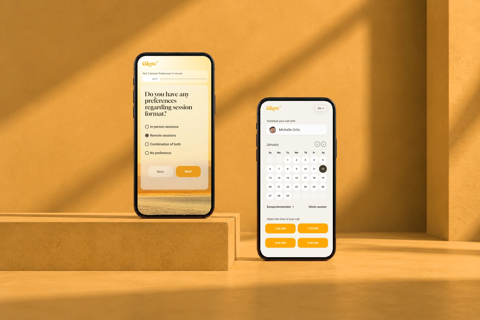
Session preferences and scheduling, on mobile. Original interface in a phones presentation mockup.
Session preferences and scheduling, on mobile.

From a profile to an appointment.

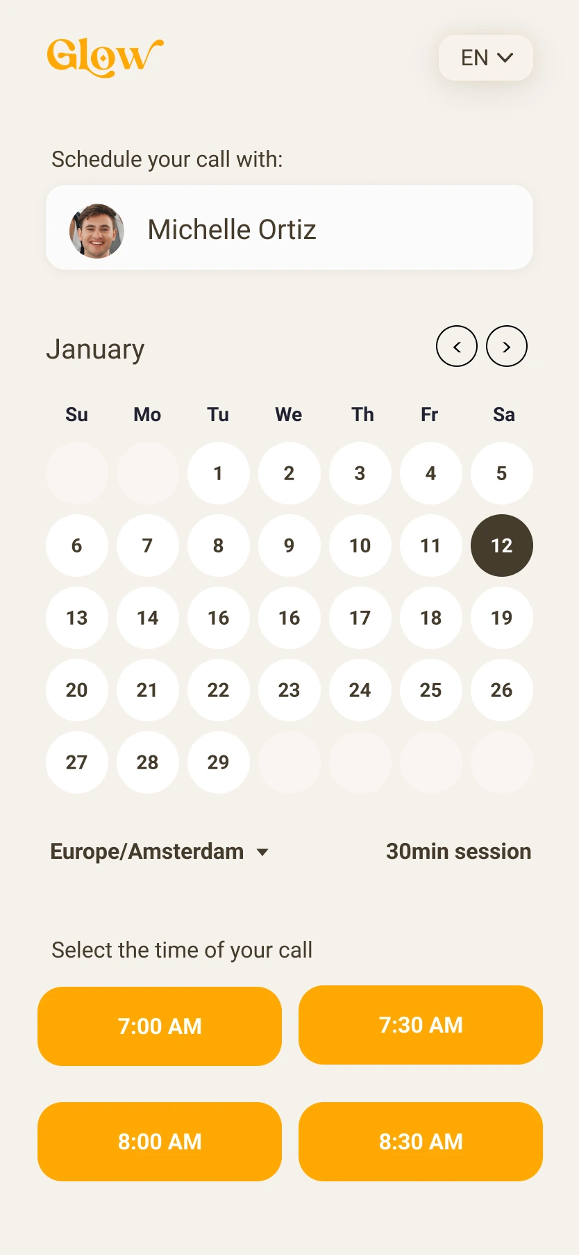
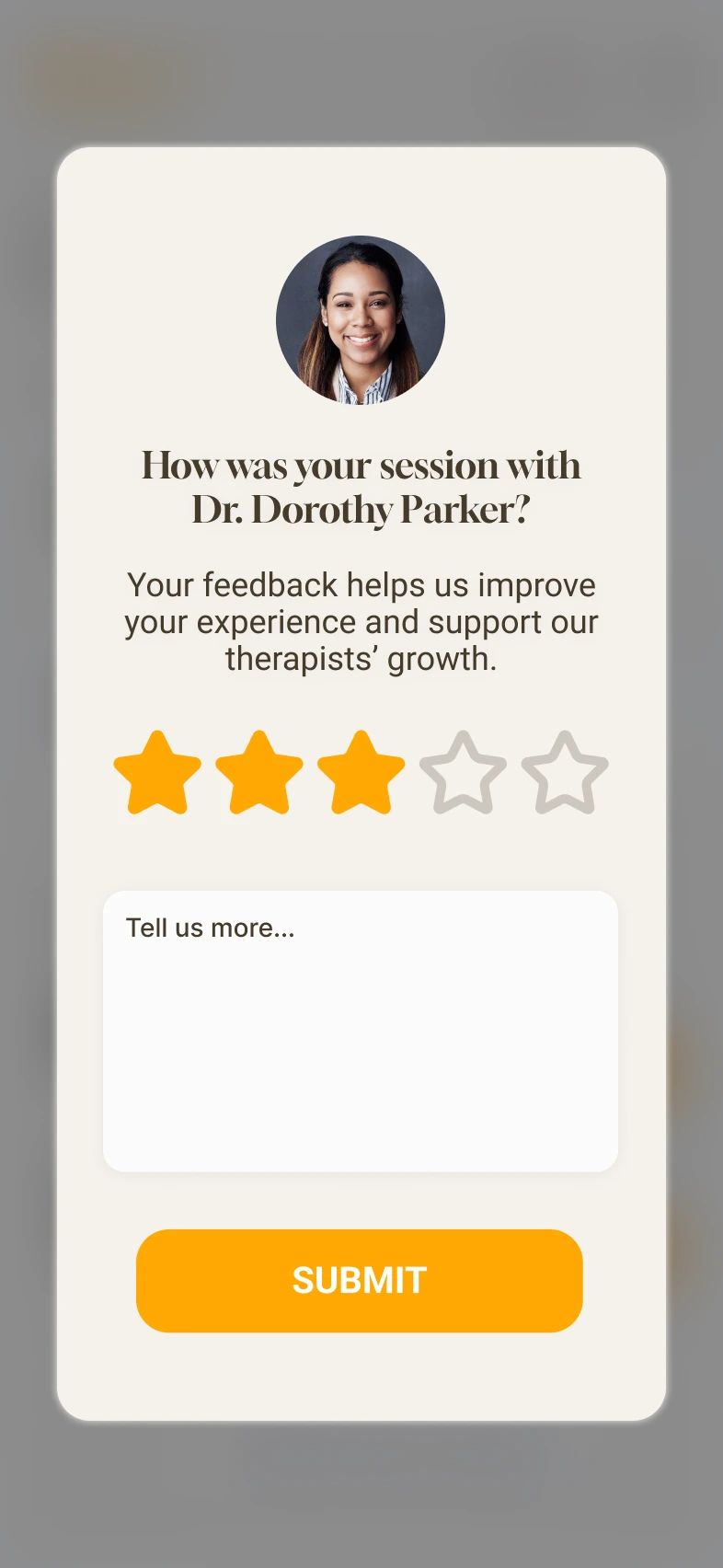
Professional details, scheduling, and feedback each use a focused mobile layout. The calendar keeps time slots and the selected professional together.

A professional profile with expandable supporting details.Full screen
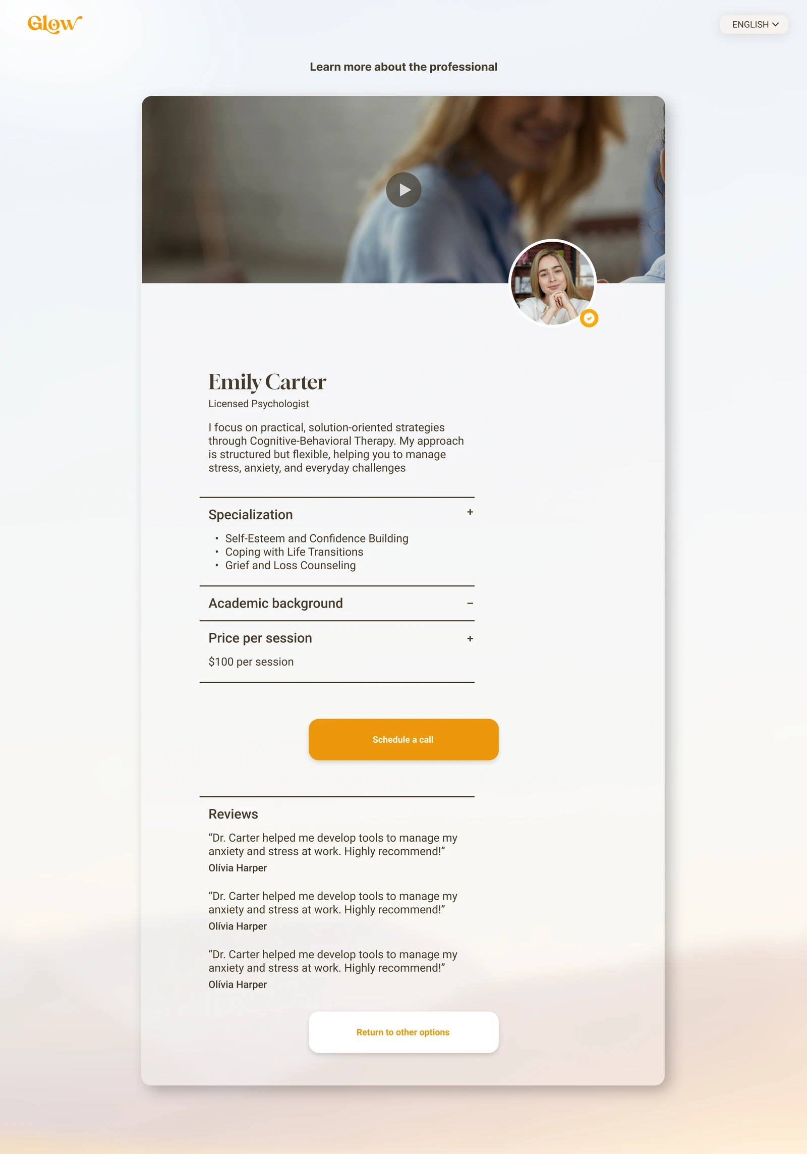
A professional profile with expandable supporting details.
Further down the profile: pricing, illustrative review content, and scheduling actions.Full screen
Further down the profile: pricing, illustrative review content, and scheduling actions.
Therapist context, calendar, and session time slots.Full screen
Therapist context, calendar, and session time slots.
Rating and optional written feedback after a session.Full screen
Rating and optional written feedback after a session.

How the pieces connect.

A retrospective map of the design. The scenarios below are working hypotheses for future validation.

GlowExperience map
01

Find a therapist

  • Preference questionnaire
  • Recommended professionals
  • Restart the survey
02

Explore a professional

  • Approach and introduction
  • Specialization and academic background
  • Price and reviews
03

Schedule a call

  • Selected professional
  • Calendar date
  • Available time slots
04

Manage personal sessions

  • Upcoming sessions
  • Past sessions and Book Again
  • Match with a new therapist
05

Manage a professional workspace

  • Session requests and responses
  • Upcoming and past sessions
  • Overview indicators

Find and schedule a professional

  1. 01

    Describe preferences

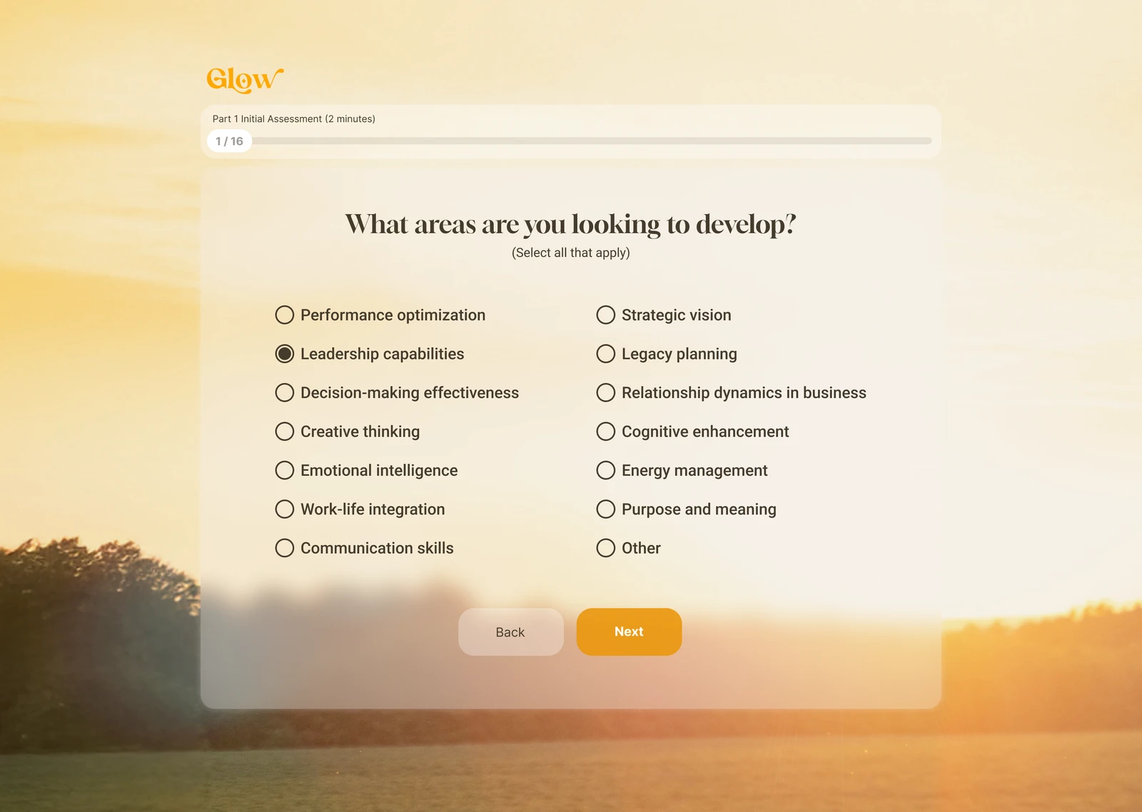
    Choose the areas of development in the questionnaire.

  2. 02

    Compare recommendations

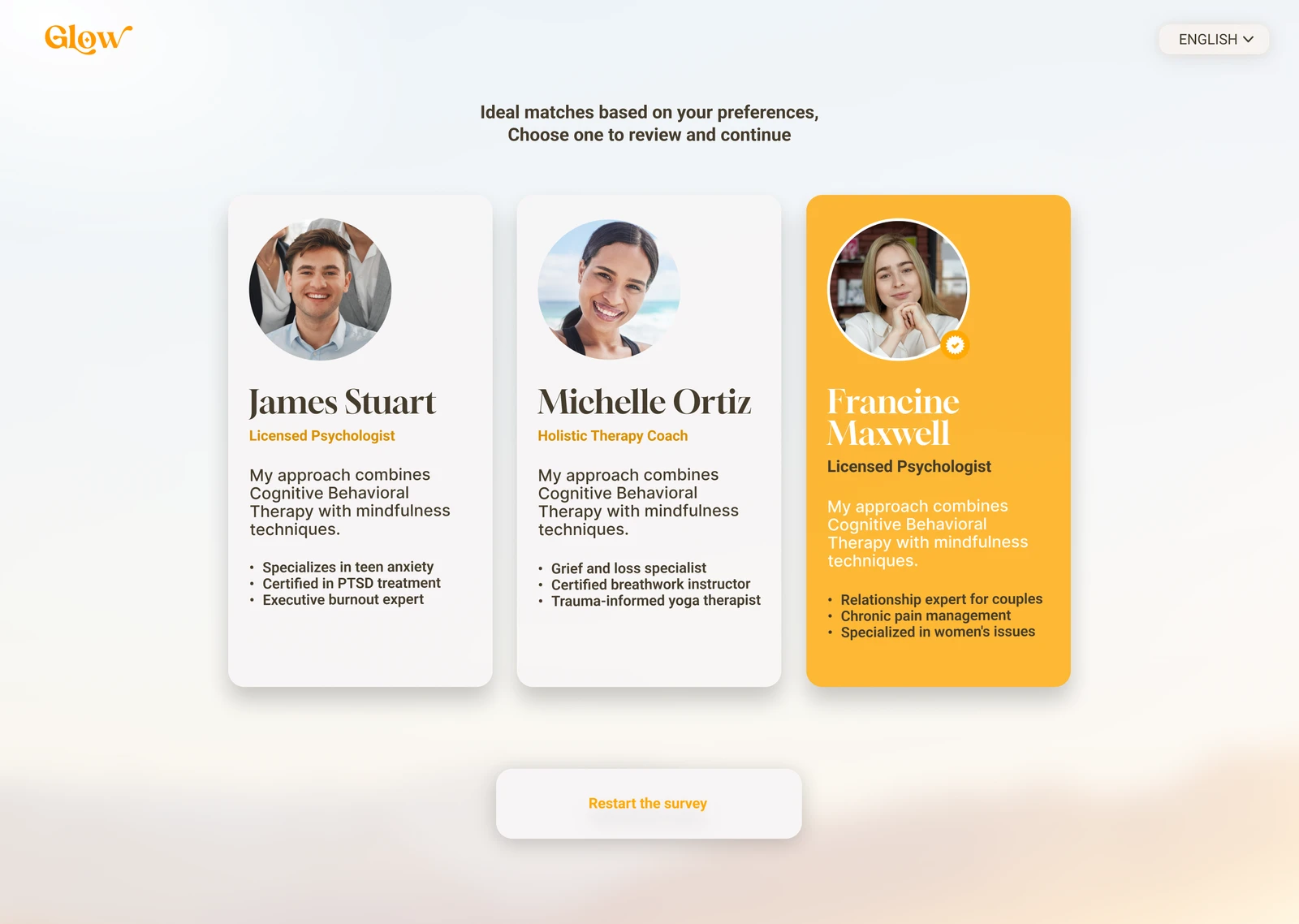
    Review the short professional cards and their stated approaches.

  3. 03

    Explore a profile

    Read the introduction, specialization, background, price, and reviews.

  4. 04

    Choose a date and time

    Use the calendar and available time slots for the selected professional.

  5. 05

    Manage sessions

    Use the client workspace to inspect upcoming and past sessions and return to booking.

Illustrative scenario

Find a professional with relevant expertise

Someone wants to compare professionals before choosing an appointment.

Task
Express preferences, inspect a shortlist, read a profile, and choose a time.
Design response
The interface progresses from broad preferences to comparable cards, a detailed profile, and a calendar.

Illustrative scenario

Review requests in a professional workspace

A professional wants to organize new session requests and existing appointments.

Task
Scan pending requests, use Accept or Decline, and inspect the upcoming schedule.
Design response
Requests have their own section above the upcoming and past session lists.

Make each decision manageable.

The questionnaire frames preferences. A shortlist then makes professionals comparable, before a detailed profile and calendar support the next decision.

A focused question with visible progress.Full screen
A focused question with visible progress.
Comparable profile cards lead to a clear choice.Full screen
Comparable profile cards lead to a clear choice.
Professional background and approach have room to be read.Full screen
Professional background and approach have room to be read.
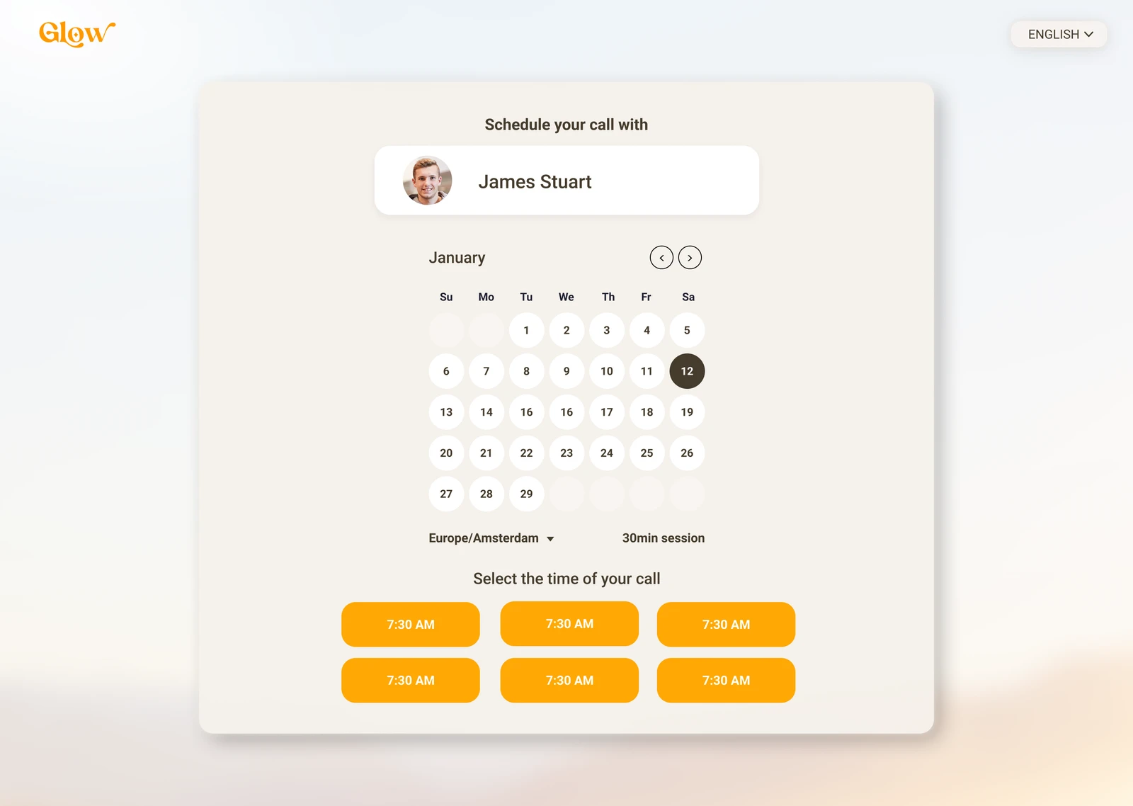
The selected professional stays visible beside the calendar.Full screen
The selected professional stays visible beside the calendar.

The service continues after booking.

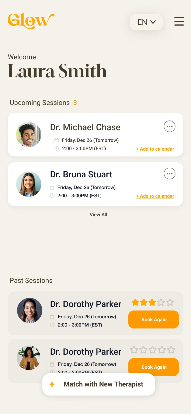
Client and professional workspaces prioritize different actions. Account settings and contextual support keep the wider service within reach on mobile.

The client’s upcoming and previous appointments.Full screen
The client’s upcoming and previous appointments.
Requests and session management for professionals.Full screen
Requests and session management for professionals.
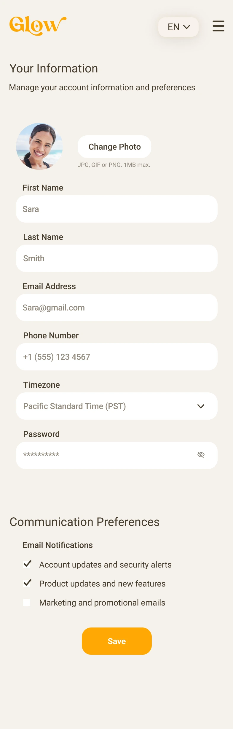
Account information and communication preferences.Full screen
Account information and communication preferences.
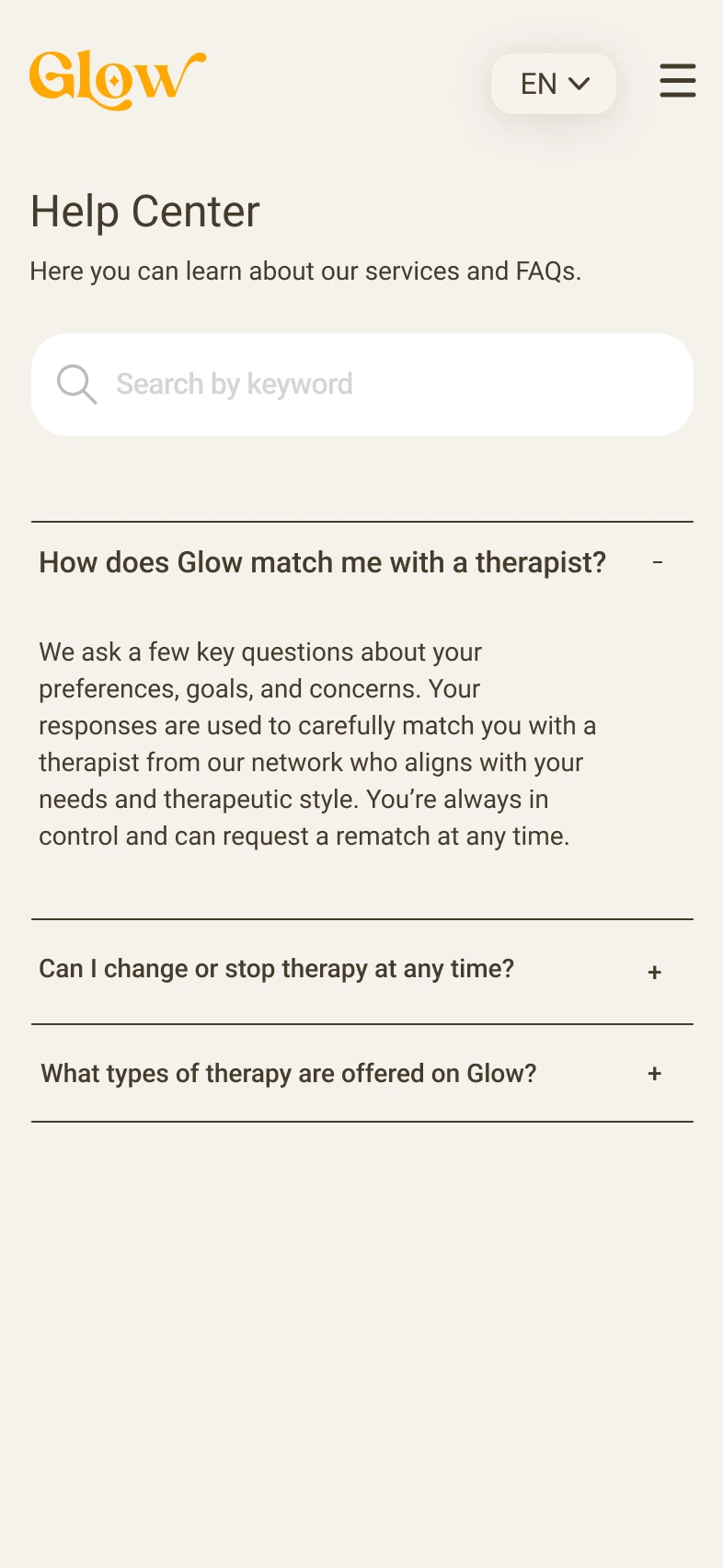
Search and expandable answers in the help center.Full screen
Search and expandable answers in the help center.
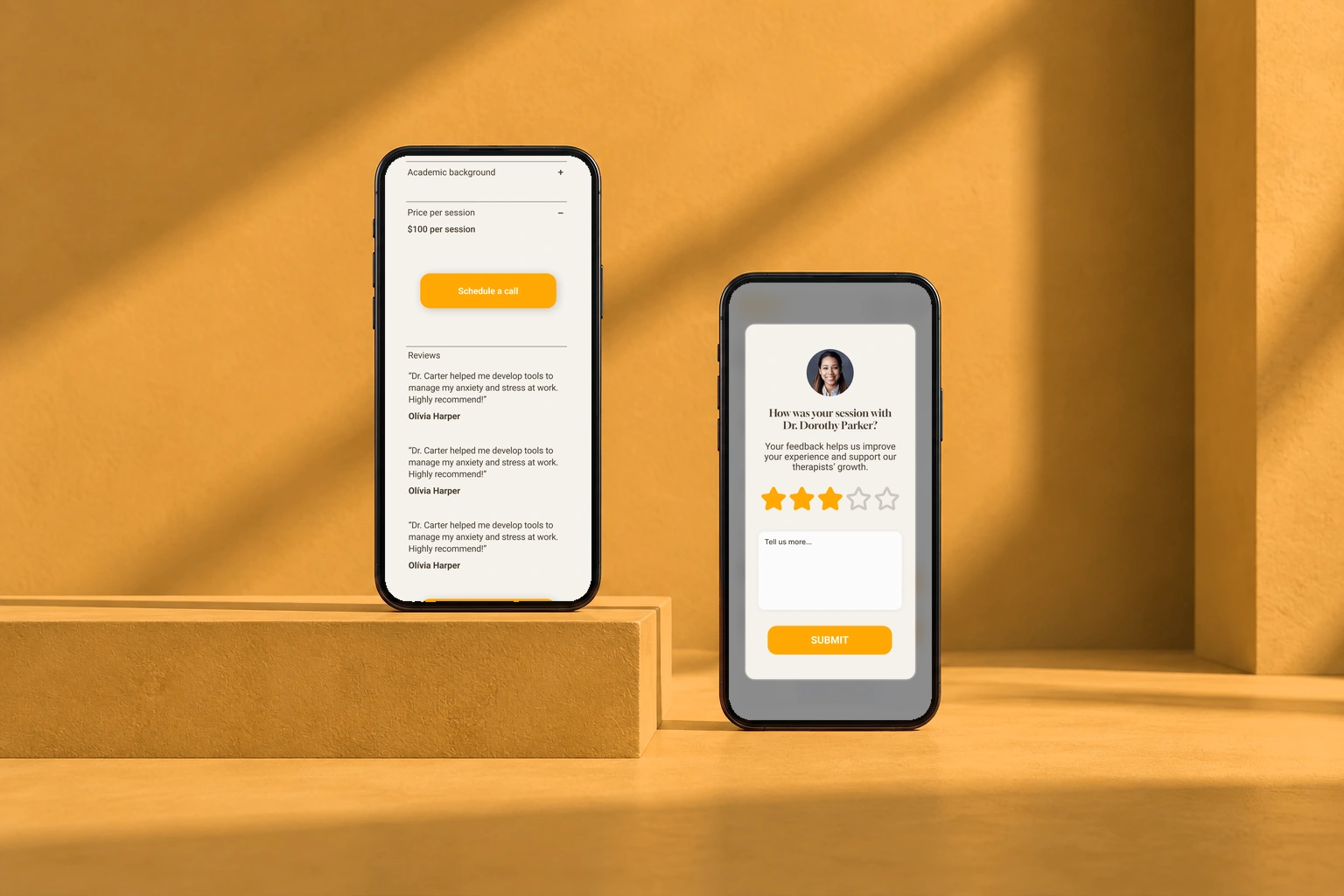
Professional profiles and post-session feedback. Original interface in a phones presentation mockup.
Professional profiles and post-session feedback.

Two sides of the same service.

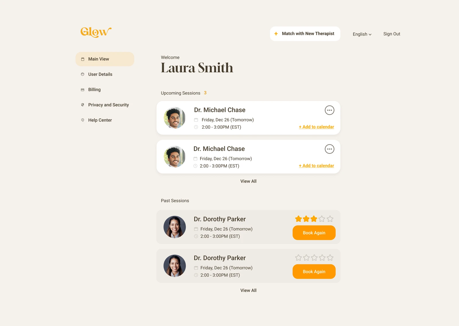
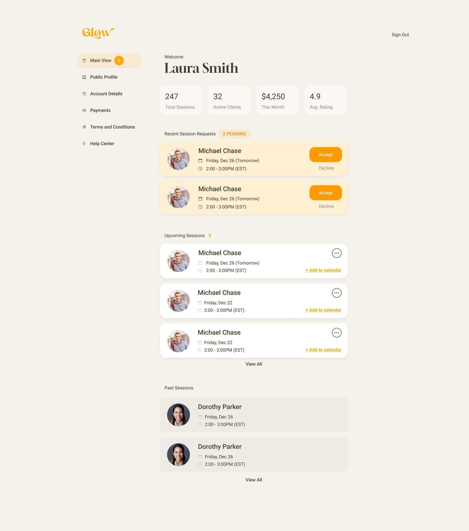
Clients need their appointments and a route back into booking. Professionals need requests, responses, and the schedule. Each workspace organizes the relevant actions.

Client workspace: upcoming appointments and past sessions.Full screen
Client workspace: upcoming appointments and past sessions.
Professional workspace: incoming requests and session management.Full screen
Professional workspace: incoming requests and session management.

Character, with a consistent structure.

#F5F1EB
#EFEBE5
#453B2C
#FF9900

Professional profile card

Portrait, name, role, and approach form the comparison unit; desktop columns become stacked mobile cards.

Session card

An avatar, date, time, and contextual action combine into a rounded card used in client and professional workspaces.

Calendar and time-slot controls

A selected date is paired with distinct orange time buttons within one scheduling panel.

What took shape.

A redesigned assessment-to-booking journey and product demo, supported by separate client and therapist dashboards. Desktop and mobile layouts show how the shared service adapts to each side’s tasks.

ClientGlow
ExperienceClient and therapist journeys
DeliveryProduct redesign and demo

Next design question

A recommendation needs more than a reassuring visual treatment. The next iteration should help clients understand why a therapist was suggested and how to change their preferences, then test whether that information supports a confident choice.

Next projectEmbassy