All work09 / 09

Concept · Hospitality & membership

Harmony

A quieter way to experience a hotel membership.

My contribution

I explored the app concept, information structure and mobile visual direction using the Harmonie Resort identity.

Stage

Unbuilt concept

Timeline

Design exploration

The problem

A membership companion needed to combine practical navigation with the character of the place.

What I delivered

Original mobile designs for the resort home, experience feed, spa content and navigation.

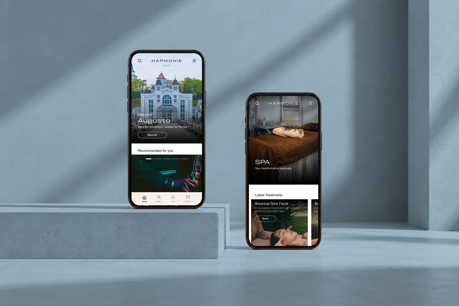
Original Harmony hotel membership designs in two phones against a blue-gray background

Original Figma screens in a presentation mockup. Unbuilt concept; the interface uses the Harmonie Resort identity.

What shaped the experience.

This early concept focuses on discovery, content and navigation; a complete reservation flow is outside the designed scope.

01 / Design rationale

Let the place lead discovery

Use resort photography and experience-led content modules across the home, feed and spa screens.
Design detail — Let the place lead discovery (1)Design detail — Let the place lead discovery (2)Explore the original

Why this structure

The visual direction connects activities with the character of the hotel before asking the member to choose a destination.
02 / Design rationale

Give destinations a direct navigation layer

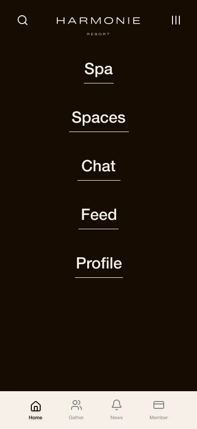
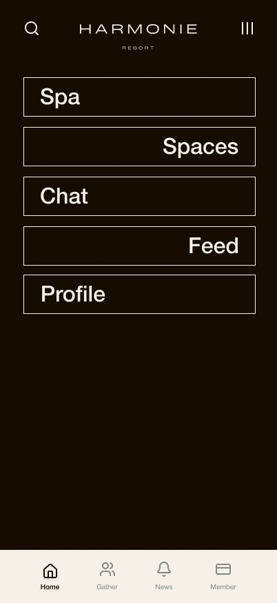
Collect spa, spaces, chat, feed and profile in a readable menu, alongside the persistent bottom navigation.

Design detail — Give destinations a direct navigation layer (1)Design detail — Give destinations a direct navigation layer (2)Explore the original

Why this structure

The design offers explicit routes to member areas alongside the more exploratory content feed.

The design, in detail.

From the welcome to the next experience.

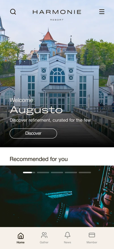
The discovery feed changes its layout to suit the content: a personal welcome, a full-image event, and compact cards for bookable spaces. These excerpts show the original design beyond its opening viewport.

A personal welcome and persistent member navigation.Full screen
A personal welcome and persistent member navigation.
Event details and a booking action within the recommendation.Full screen
Event details and a booking action within the recommendation.
Space cards pair a venue with its floor and booking control.Full screen
Space cards pair a venue with its floor and booking control.
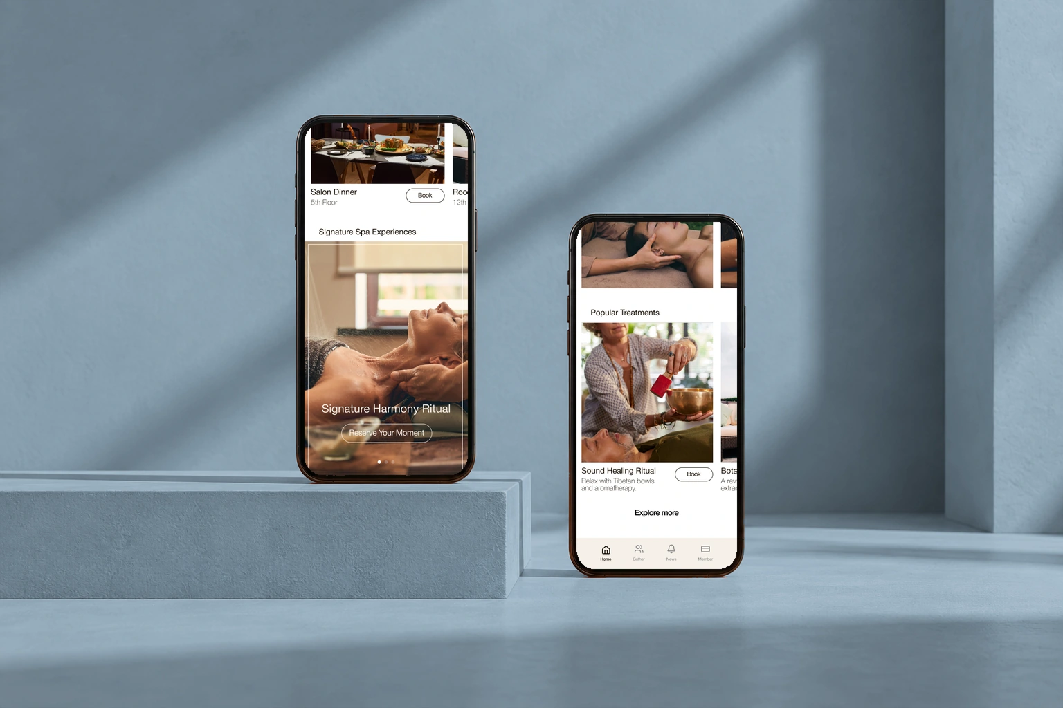
Further into the experience: dining, spa rituals, and treatment discovery. Original interface in a phones presentation mockup.
Further into the experience: dining, spa rituals, and treatment discovery.

A different pace for each kind of content.

A spa feature uses the full width for atmosphere, while member events use shorter cards with a description. The next card remains partly visible to signal more content.

A signature ritual with an overlaid reservation action.Full screen
A signature ritual with an overlaid reservation action.
Member events in the lower section of the discovery feed.Full screen
Member events in the lower section of the discovery feed.

Treatment details come into view.

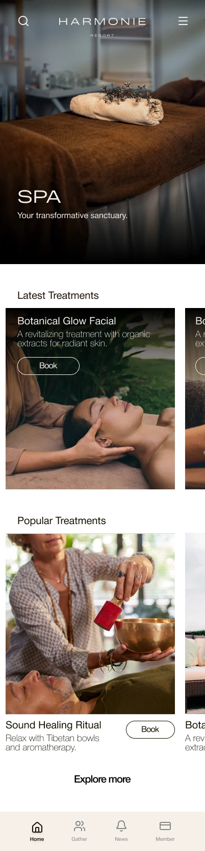
The spa opening leads into two treatment layouts. Featured treatments place the description over photography; the next section moves it below the image, beside a distinct booking action.

The spa introduction and first route into treatments.Full screen
The spa introduction and first route into treatments.
Featured treatment: image, explanation, and booking action.Full screen
Featured treatment: image, explanation, and booking action.
Treatment cards, supporting descriptions, and an Explore more action.Full screen
Treatment cards, supporting descriptions, and an Explore more action.

Exploring the member navigation.

Two original menu studies explore the same destinations through different layouts. Both keep the member navigation visible at the bottom.

A centered menu with a simple type hierarchy.Full screen
A centered menu with a simple type hierarchy.
An alternative study using staggered outlined rows.Full screen
An alternative study using staggered outlined rows.

Character, with a consistent structure.

#F4F2E9
#7C939B
#D8DFD7
#263B40

What took shape.

Original mobile designs showing a visual direction, content layouts, and initial information structure. This is an unbuilt app concept; reservations, search, and membership operations are not represented as delivered features.

ContextHotel membership concept
FormatMobile app design
DeliveryInitial interface exploration

Next design question

The next design step is to define a complete member task, including availability, booking rules, confirmation, and cancellation, then test the terminology with prospective members.

Next projectLevel Up