All work05 / 09

Client project · Institutional website & admissions

New York Academy of Art

A website for the art. A clearer path to the Academy.

My contribution

Within AGD, I worked on website UX/UI, admissions, responsive refinements, content implementation and QA.

Stage

Live website · design and implementation work

Timeline

2025–2026

The problem

The Academy's website had to connect expressive artwork and institutional content with practical, dependable routes into admissions.

What I delivered

Institutional and application designs, documented admissions updates, responsive corrections and implementation feedback.

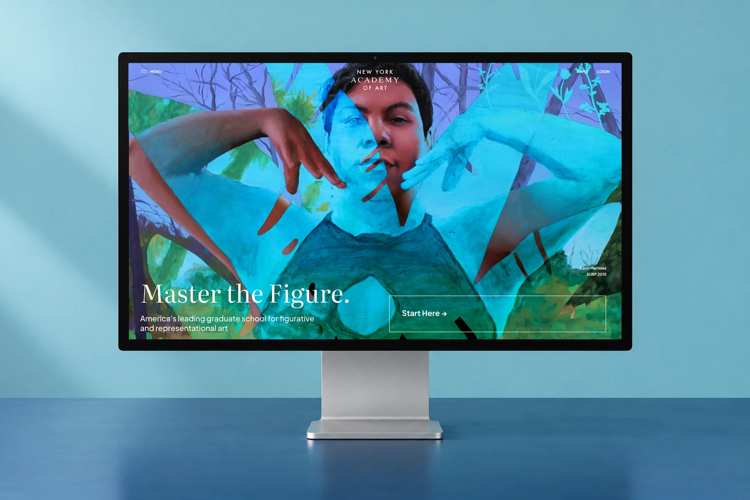
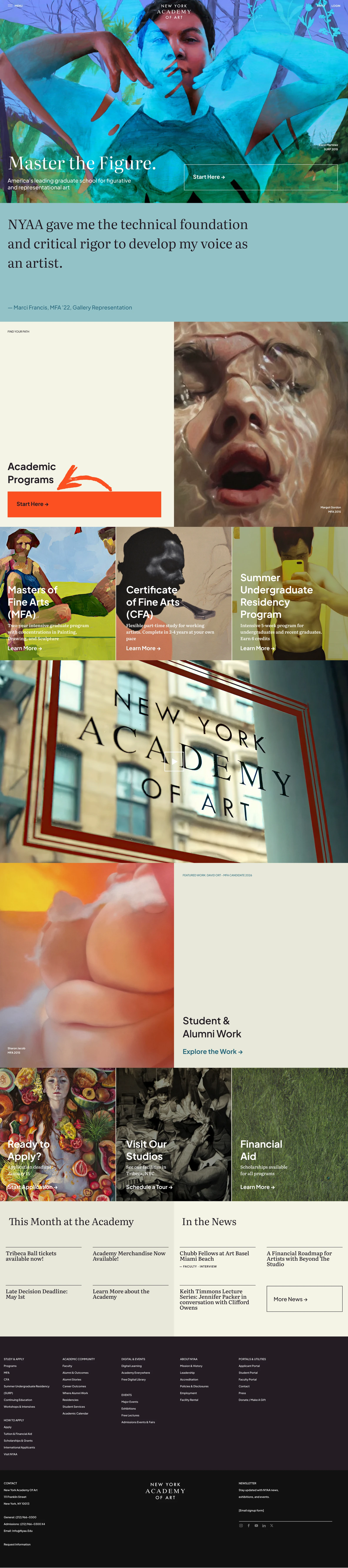
Original New York Academy of Art website on a desktop display against a deep blue background

Original Figma designs in a presentation mockup. Work created within the AGD team.

What shaped the experience.

A large content system and a multi-step application had to stay coherent across page types, devices and implementation changes.

01 / Design & implementation

From repeated actions to a clearer application route

I helped carry those design choices into the site and rebuilt the numbered How to Apply steps as editable text, following the Figma design.

Design detail — From repeated actions to a clearer application routeExplore the original

Selected design reference from the project.

Review & follow-through

The July implementation record documents the revised links, action hierarchy and editable steps on staging.

Discussion & delivery

Admissions contained overlapping calls to action and review information distributed across the page.

The documented revision consolidated the existing content: a repeated action row was removed, review explanations moved into the overview and the main Apply action led to the Apply Hub.

Documented implementation changes. The work demonstrates a clearer interface structure; application conversion was not measured.

02 / Design & implementation

Follow a responsive fix through the system

I worked through the responsive corrections, then reviewed the affected page family after a stray content block appeared inside the SURP hero.

Design detail — Follow a responsive fix through the systemExplore the original

Selected page design, shown as context for the responsive work.

Review & follow-through

The implementation report records removal of the stray block and a follow-up sweep of the other mirrored heroes.

Discussion & delivery

Some tablet hero images were unconfigured, while credits and introductory content differed between devices.

The correction reused the established page content across breakpoints. A later review showed that mirroring every paragraph could also introduce unwanted content.

Corrections and follow-up checks documented. Pages awaiting final artwork remained identified for the team.

The design, in detail.

Beyond the opening image.

The homepage brings several layouts together: artwork-led program cards, a split feature for student work, and a compact news grid. Each module gives a different kind of content its own rhythm.

Program pathways with a direct entry action and individual study cards.Full design
Program pathways with a direct entry action and individual study cards.
A split image-and-copy feature for student and alumni work.Full design
A split image-and-copy feature for student and alumni work.
Two editorial columns organize Academy updates and press coverage.Full design
Two editorial columns organize Academy updates and press coverage.
Artwork takes the full width of the layout, further down the page. Original interface in a display presentation mockup.
Artwork takes the full width of the layout, further down the page.

Make space for the people and their work.

A compact faculty directory, an artwork grid, and alternating leadership profiles use different densities while sharing the same visual language.

A faculty directory pairs portraits with names and disciplines.Full design
A faculty directory pairs portraits with names and disciplines.
An image-led grid keeps the artwork at the center.Full design
An image-led grid keeps the artwork at the center.
Alternating portrait and biography modules for leadership.Full design
Alternating portrait and biography modules for leadership.

How the pieces connect.

A retrospective map of the design. The scenarios below are working hypotheses for future validation.

NYAAExperience map
01

The Academy

  • Home
  • Mission, history, and facilities
  • Community and academy life
02

Academic programs

  • Program overview
  • MFA information and curriculum
  • Program requirements and next steps
03

Creative work

  • Faculty work
  • Student and alumni work entry points
  • Artwork galleries
04

Exhibitions and events

  • Exhibition information
  • Dates, venue, and location
  • Works and catalogue entry points
05

Start an application

  • Compare programs in Apply Hub
  • Requirements and deadlines
  • Create an account
06

Complete an application

  • Contact details and staged progress
  • Portfolio and supporting information
  • Guidance and Ask Admissions

From program exploration to application confirmation

  1. 01

    Explore programs

    Read the program page and its application entry point.

  2. 02

    Choose a program

    Compare program information and requirements in the Apply Hub, then start an application.

  3. 03

    Create an account

    Enter account information to save progress and continue.

  4. 04

    Complete details and portfolio

    Continue through application sections and upload supporting work; the walkthrough reports that uploads and portfolio editing were possible.

  5. 05

    Submit the application

    Submit after completing the application; the walkthrough reports slow feedback and an error message during this stage.

  6. 06

    Receive confirmation

    The walkthrough reports a confirmation email and a later confirmation screen despite the earlier error.

Illustrative scenario

Connect academic interest to an application

A prospective student wants to understand a program before deciding how to apply.

Task
Explore artwork and program content, compare requirements in the Apply Hub, and create an application account.
Design response
The website establishes program and institutional context, while the Apply Hub brings program choices and application requirements into a comparable layout.

Illustrative scenario

Continue an application and ask for help

An applicant working on a phone wants to continue a form and clarify the next step.

Task
Use the staged form, save progress, and open admissions guidance without abandoning the task.
Design response
The mobile design retains a step indicator, Save and Continue, Guidance, and an Ask Admissions panel. The transcript shows why persistent saving and submission feedback require attention.

Documented implementation walkthrough

What I caught in the review.

My recorded Apply Hub walkthrough surfaced specific issues to follow up during implementation.

Responsive hierarchy and alignment

I asked for a smaller blue Apply Hub area and larger imagery and text, and reported misalignment on a larger screen.

Saving visibility

I reported that the saving indicator disappears too quickly while heavier portfolio content continues processing, leaving the action without clear feedback.

Submission state consistency

I reported an error after submitting, despite receiving a confirmation email, followed by a later change to a confirmation screen.

These are review observations. The available record does not verify their resolution.

Content structure becomes a path to applying.

Expandable course information, differentiated calls to action, and a staged application form help visitors move from understanding a program to taking the next step.

Curriculum, course areas, and concentrations organized into expandable groups.Full design
Curriculum, course areas, and concentrations organized into expandable groups.
Primary application action, campus visit, and supporting admissions links.Full design
Primary application action, campus visit, and supporting admissions links.
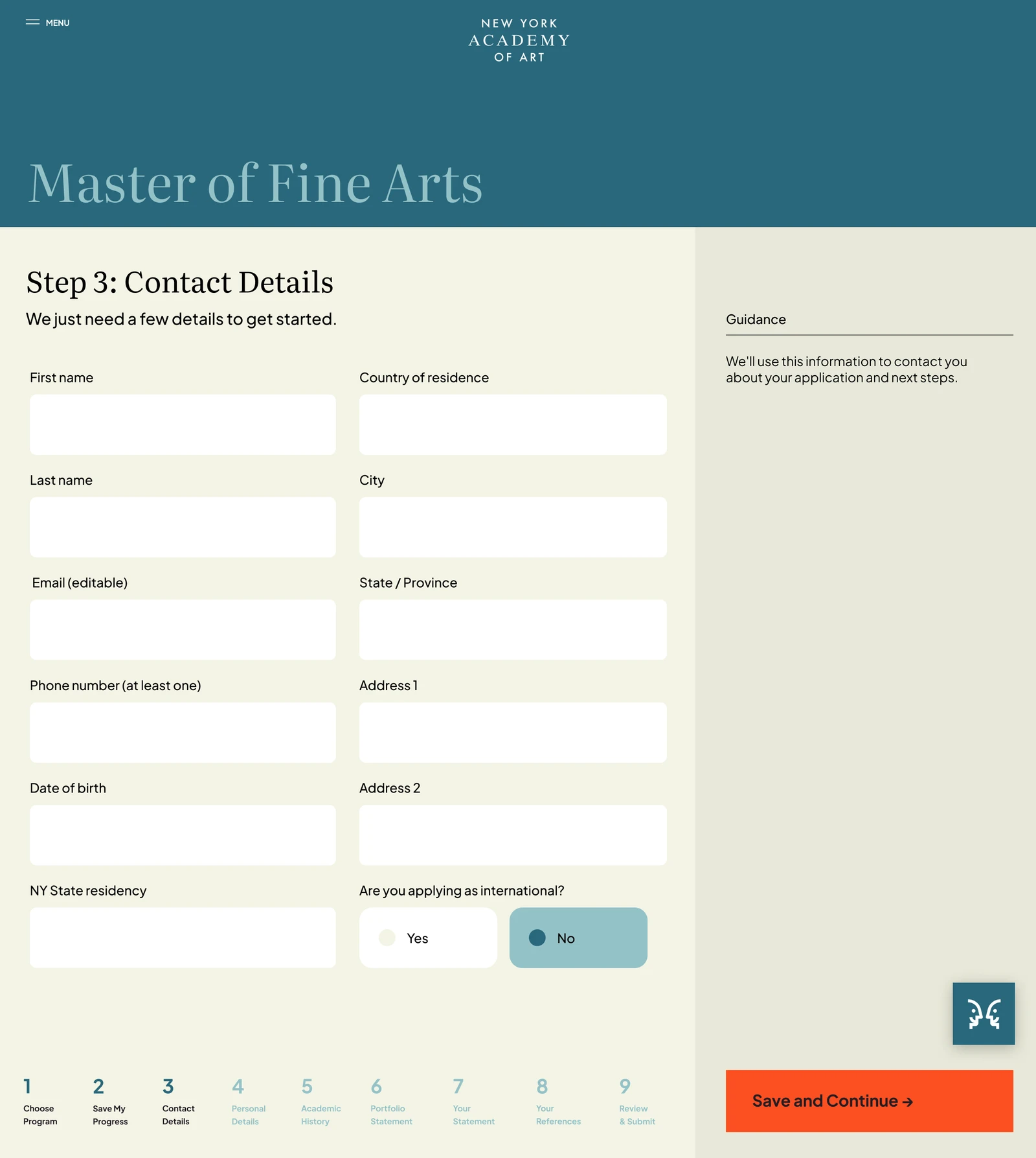
Form fields, progress, guidance, and Save and Continue in the same view.Full design
Form fields, progress, guidance, and Save and Continue in the same view.

The application, in a smaller viewport.

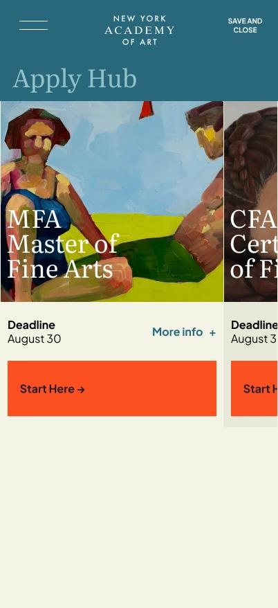
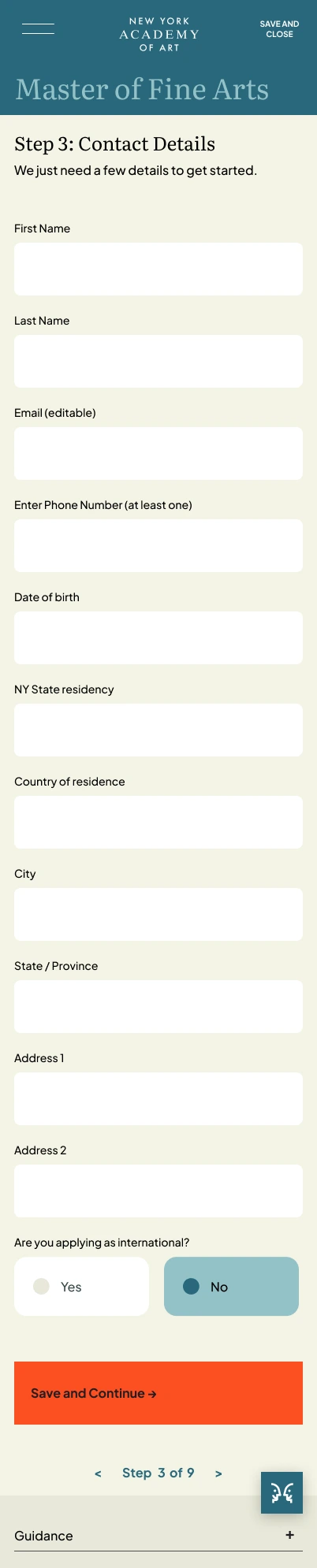
Program selection uses horizontally browsable cards. Inside the form, fields stack into a single column while progress and contextual guidance remain accessible.

Mobile program selection with a clear Start Here action.Full screen
Mobile program selection with a clear Start Here action.
The full contact step, including fields, guidance, and continuation.Full screen
The full contact step, including fields, guidance, and continuation.

Support the longer steps, too.

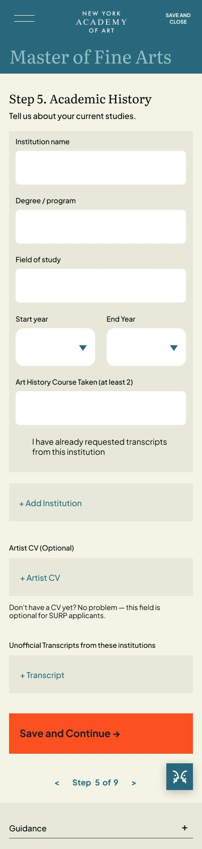
Academic history includes repeatable institutions and supporting uploads. A dedicated submission state gives the application a clear stopping point.

Education details, document uploads, and step navigation.Full screen
Education details, document uploads, and step navigation.
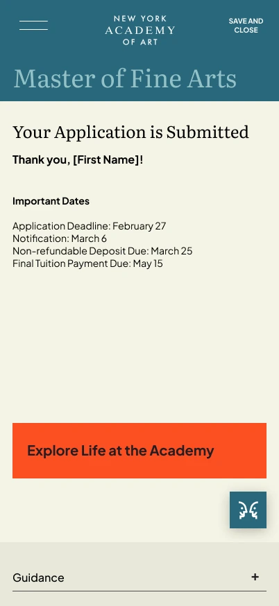
Original confirmation design with placeholder name and sample dates.Full screen
Original confirmation design with placeholder name and sample dates.
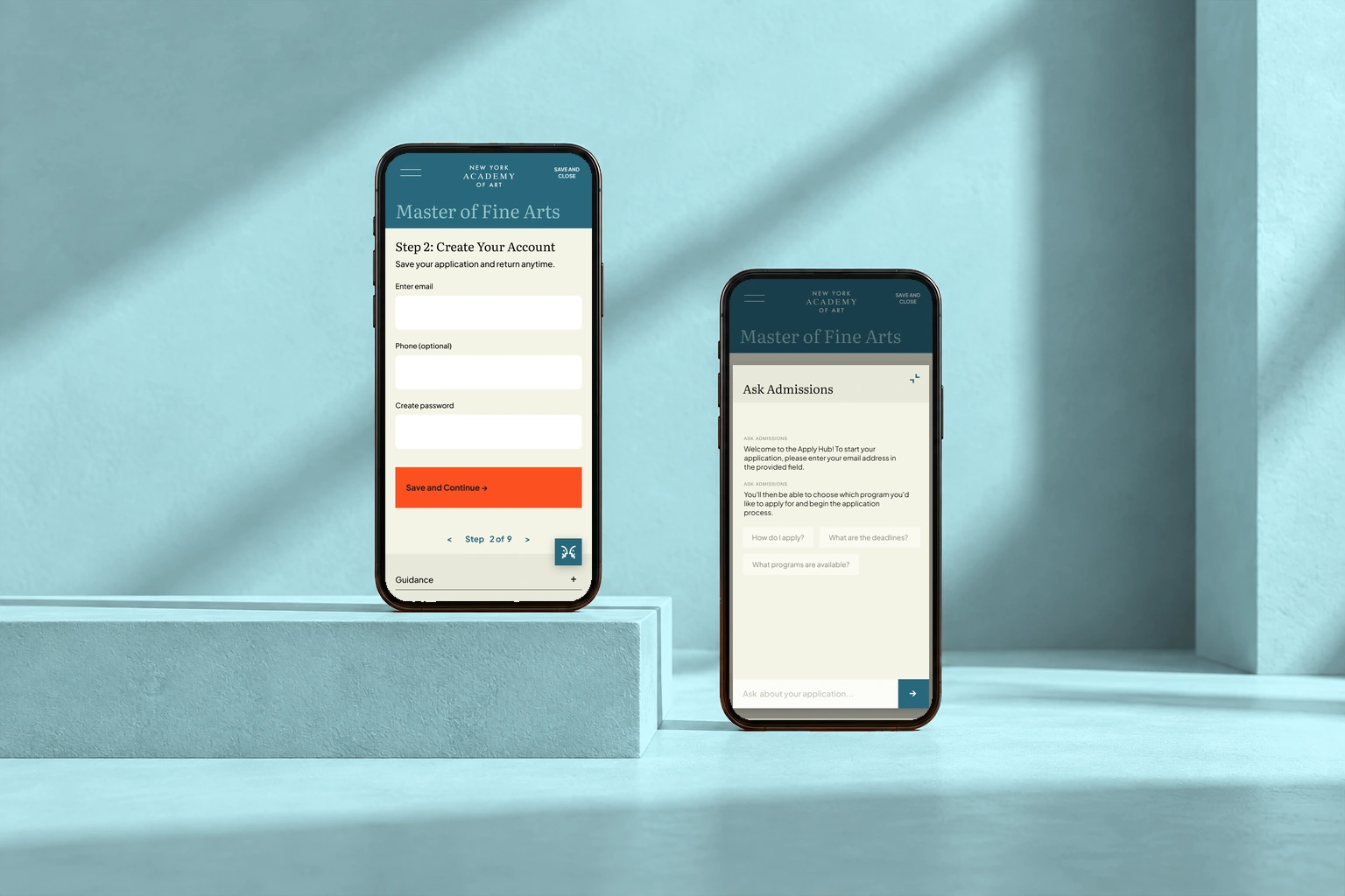
Admissions on mobile: account creation and access to guidance. Original interface in a phones presentation mockup.
Admissions on mobile: account creation and access to guidance.

Different layouts for different reading tasks.

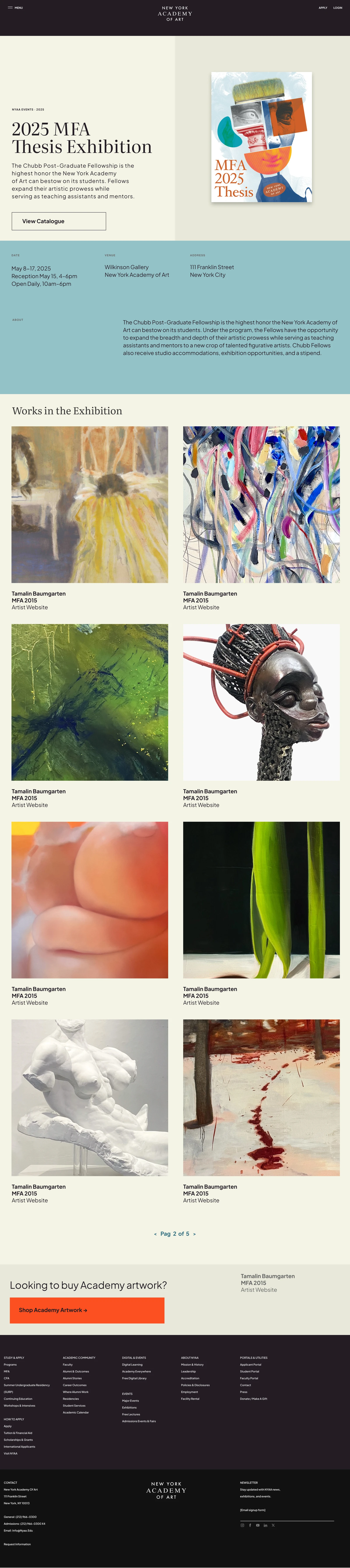
Facilities use a directory. Alumni stories use an editorial feature and cards. Exhibition pages group practical details beside a longer introduction.

An expandable facilities directory over a subtle artwork background.Full design
An expandable facilities directory over a subtle artwork background.
An alumni feature and story cards; original draft copy shown.Full design
An alumni feature and story cards; original draft copy shown.
Dates, venue, address, and exhibition information below the hero.Full design
Dates, venue, address, and exhibition information below the hero.

Events have their own mobile patterns.

Ticket options use repeated content blocks and quantity controls. The event archive combines year-by-year information with galleries and image navigation.

Original ticket-selection modules with quantity controls and sample event prices.Full screen
Original ticket-selection modules with quantity controls and sample event prices.
A mobile event archive with galleries and carousel controls.Full screen
A mobile event archive with galleries and carousel controls.

Character, with a consistent structure.

#94C2C8
#29687C
#F4F4E5
#FC4F21

Artwork-led page opening

Large imagery, serif titles, compact top navigation, and contrasting content sections establish a recurring institutional page pattern.

Program comparison card

A program image and title sit above practical requirements and a clear application action, repeated across the Apply Hub.

Application form shell

A colored program header, light form area, step navigation, orange continuation action, and contextual help combine into a shared application structure.

What took shape.

A connected set of institutional page designs and application screens, supported by responsive refinements and implementation feedback. The project demonstrates work across a substantial content system as well as a focused application flow.

ContextAGD team project
ScopeInstitutional website + Apply Hub
ContributionUX/UI + responsive implementation review

Next design question

In my recorded implementation walkthrough, I flagged saving feedback that disappeared too quickly and an error message that conflicted with an eventual submission confirmation. These observations identify what still needed to be verified; they are not claimed as resolved outcomes.

Next projectThe Lilie